今天来学学更多的flutter的组件
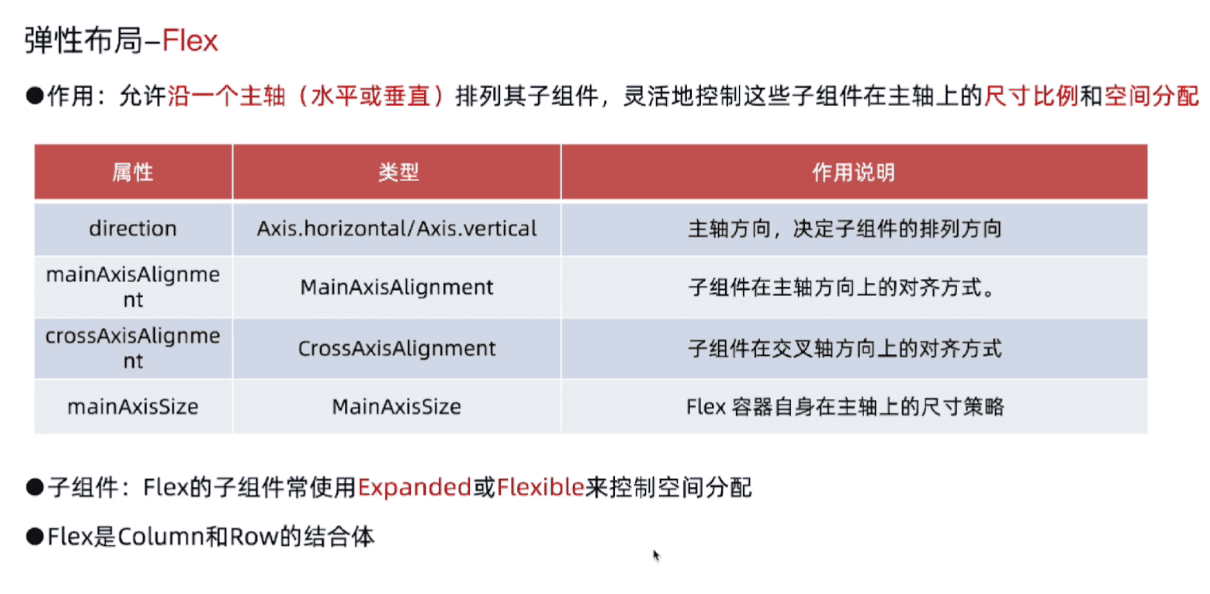
弹性布局-Flex
Expanded
1
2
3
4
5
6
7
8
9
10
11
12
13
14
15
16
17
18
19
20
21
22
23
24
25
26
27
28
29
30
31
32
33
34
35
36
37
38
39
40
41
42
43
44
45
46
47
48
49
50
51
52
| import 'package:flutter/material.dart';
void main() {
runApp(MainPage());
}
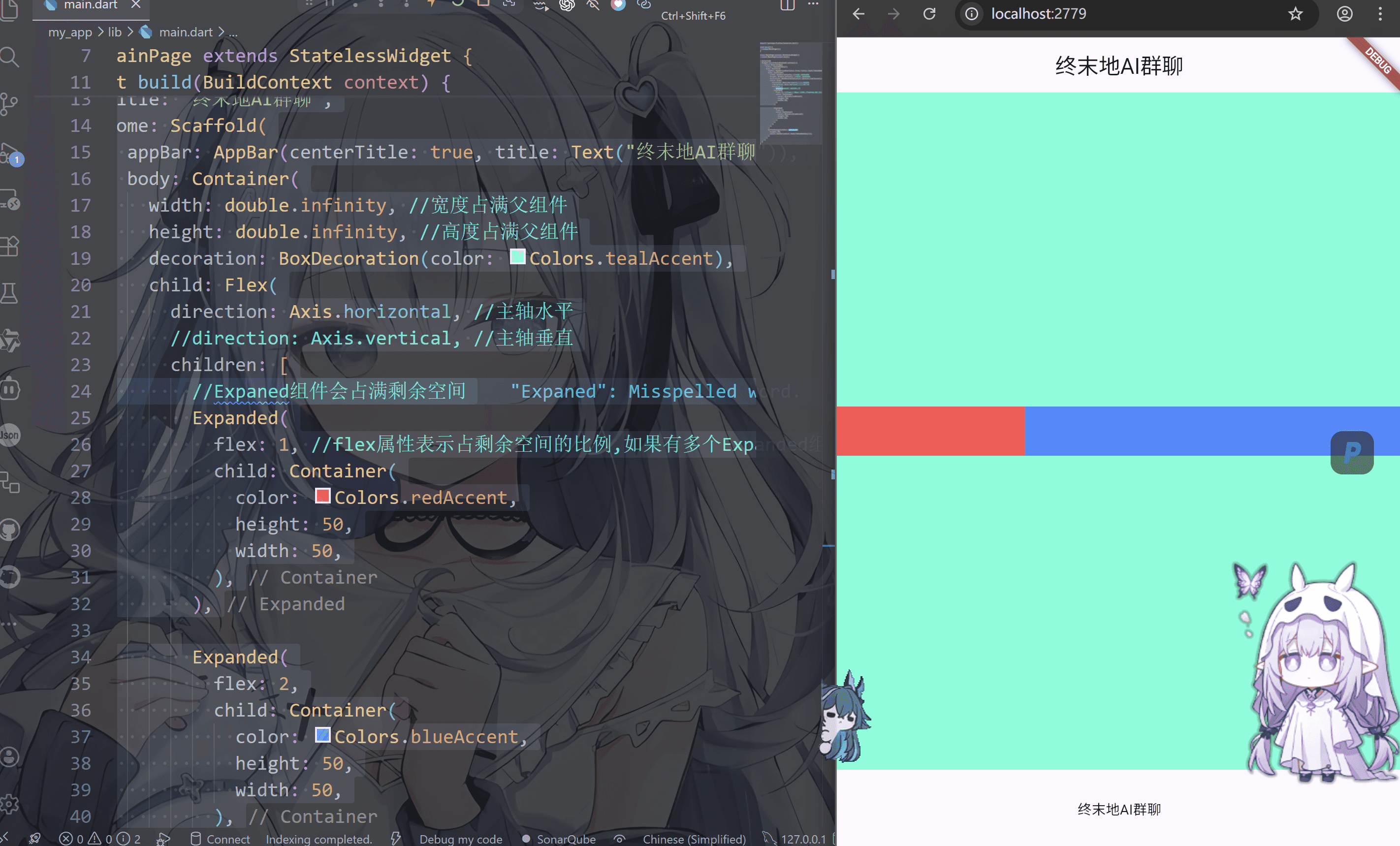
class MainPage extends StatelessWidget {
const MainPage({super.key});
@override
Widget build(BuildContext context) {
return MaterialApp(
title: "终末地AI群聊",
home: Scaffold(
appBar: AppBar(centerTitle: true, title: Text("终末地AI群聊")),
body: Container(
width: double.infinity,
height: double.infinity,
decoration: BoxDecoration(color: Colors.tealAccent),
child: Flex(
direction: Axis.horizontal,
children: [
Expanded(
flex: 1,
child: Container(
color: Colors.redAccent,
height: 50,
width: 50,
),
),
Expanded(
flex: 2,
child: Container(
color: Colors.blueAccent,
height: 50,
width: 50,
),
),
],
),
),
bottomNavigationBar: Container(
height: 80,
child: Center(child: Text("终末地AI群聊")),
),
),
);
}
}
|
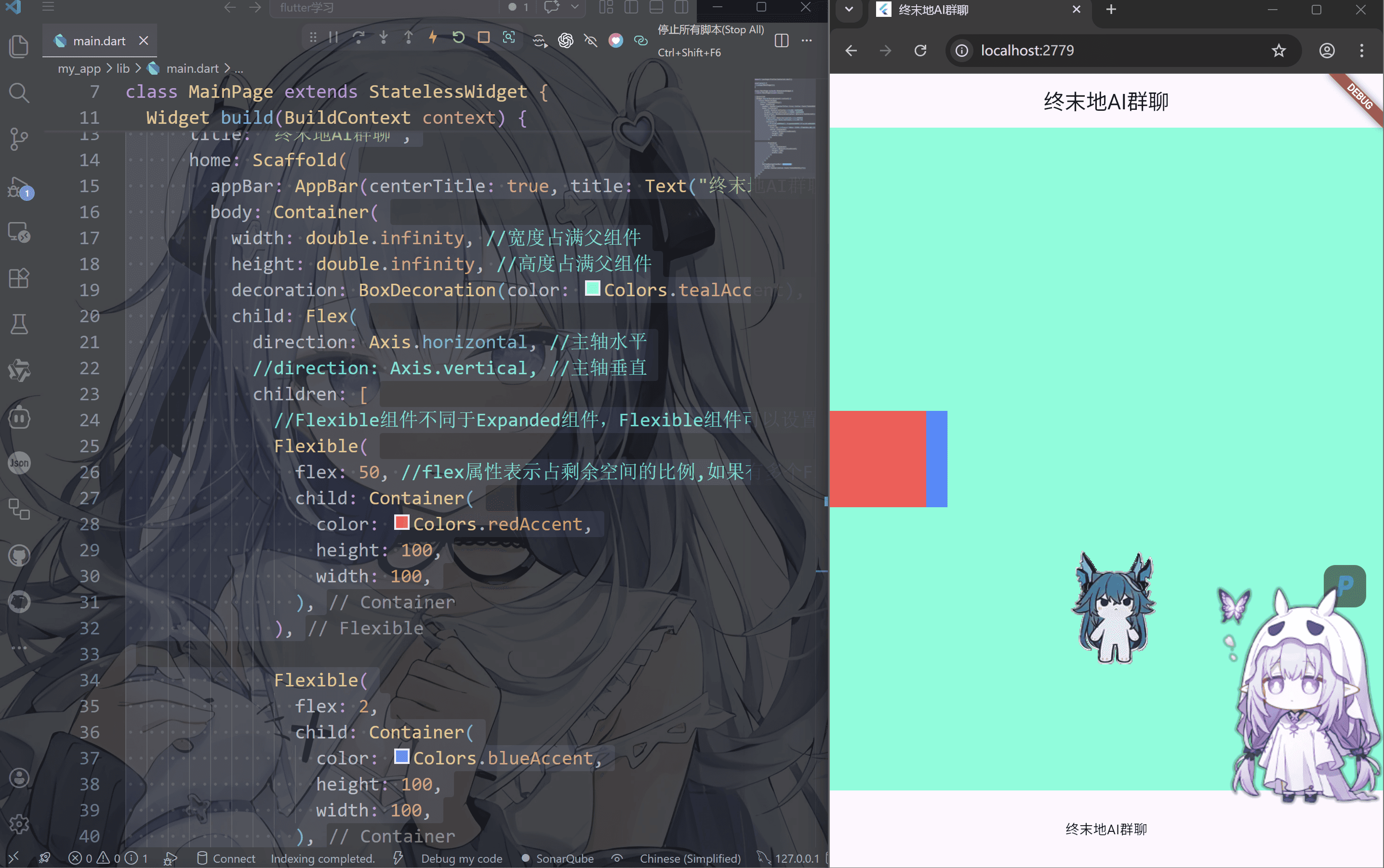
Flexible
1
2
3
4
5
6
7
8
9
10
11
12
13
14
15
16
17
18
19
20
21
22
23
24
25
26
27
28
29
30
31
32
33
34
35
36
37
38
39
40
41
42
43
44
45
46
47
48
49
50
51
52
| import 'package:flutter/material.dart';
void main() {
runApp(MainPage());
}
class MainPage extends StatelessWidget {
const MainPage({super.key});
@override
Widget build(BuildContext context) {
return MaterialApp(
title: "终末地AI群聊",
home: Scaffold(
appBar: AppBar(centerTitle: true, title: Text("终末地AI群聊")),
body: Container(
width: double.infinity,
height: double.infinity,
decoration: BoxDecoration(color: Colors.tealAccent),
child: Flex(
direction: Axis.horizontal,
children: [
Flexible(
flex: 50,
child: Container(
color: Colors.redAccent,
height: 100,
width: 100,
),
),
Flexible(
flex: 2,
child: Container(
color: Colors.blueAccent,
height: 100,
width: 100,
),
),
],
),
),
bottomNavigationBar: Container(
height: 80,
child: Center(child: Text("终末地AI群聊")),
),
),
);
}
}
|
Flex布局受其父组件传递的约束影响。确保父组件提供了适当的布局约束
Expanded与Flexible的区别:
——– Expanded强制子组件填满所有剩余空间,
——– Flexible根据自身大小调整,不强制占满空间
我们来练习一下
1
2
3
4
5
6
7
8
9
10
11
12
13
14
15
16
17
18
19
20
21
22
23
24
25
26
27
28
29
30
31
32
33
34
35
36
37
38
39
40
41
42
| import 'package:flutter/material.dart';
void main() {
runApp(MainPage());
}
class MainPage extends StatelessWidget {
const MainPage({super.key});
@override
Widget build(BuildContext context) {
return MaterialApp(
title: "终末地AI群聊",
home: Scaffold(
appBar: AppBar(centerTitle: true, title: Text("终末地AI群聊")),
body: Container(
width: double.infinity,
height: double.infinity,
decoration: BoxDecoration(color: Colors.tealAccent),
child: Flex(
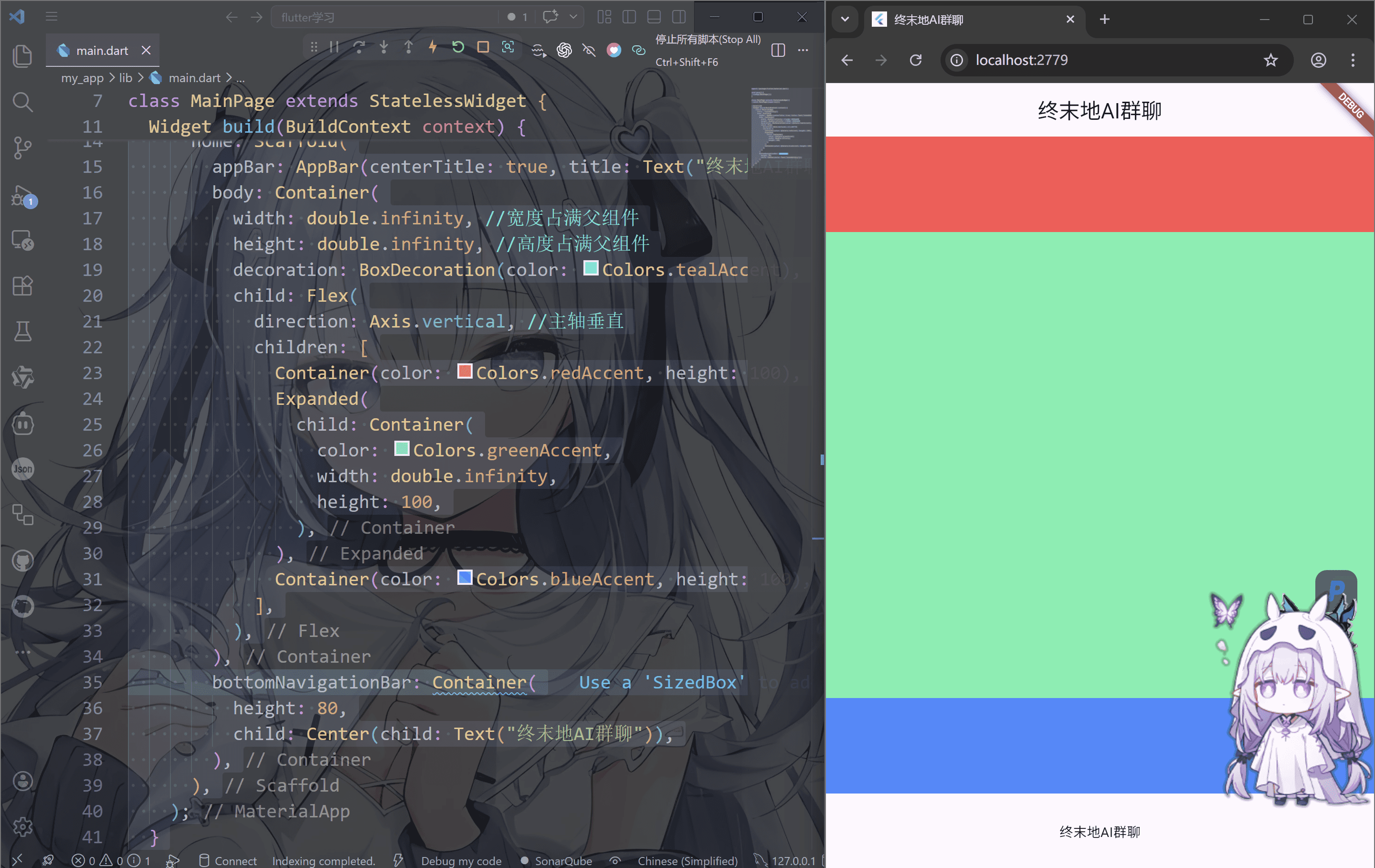
direction: Axis.vertical,
children: [
Container(color: Colors.redAccent, height: 100),
Expanded(
child: Container(
color: Colors.greenAccent,
width: double.infinity,
height: 100,
),
),
Container(color: Colors.blueAccent, height: 100),
],
),
),
bottomNavigationBar: Container(
height: 80,
child: Center(child: Text("终末地AI群聊")),
),
),
);
}
}
|
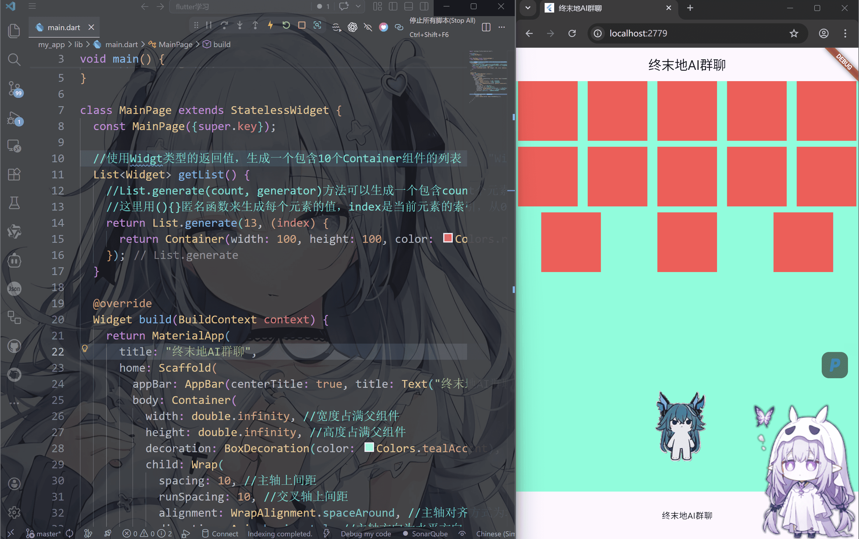
流式布局-Wrap
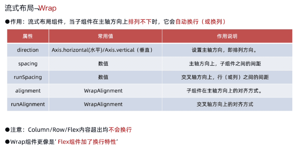
当子组件内容是根据数据动态生成时,使用wrap可以确保布局始终适配
1
2
3
4
5
6
7
8
9
10
11
12
13
14
15
16
17
18
19
20
21
22
23
24
25
26
27
28
29
30
31
32
33
34
35
36
37
38
39
40
41
42
43
44
| import 'package:flutter/material.dart';
void main() {
runApp(MainPage());
}
class MainPage extends StatelessWidget {
const MainPage({super.key});
List<Widget> getList() {
return List.generate(13, (index) {
return Container(width: 100, height: 100, color: Colors.redAccent);
});
}
@override
Widget build(BuildContext context) {
return MaterialApp(
title: "终末地AI群聊",
home: Scaffold(
appBar: AppBar(centerTitle: true, title: Text("终末地AI群聊")),
body: Container(
width: double.infinity,
height: double.infinity,
decoration: BoxDecoration(color: Colors.tealAccent),
child: Wrap(
spacing: 10,
runSpacing: 10,
alignment: WrapAlignment.spaceAround,
direction: Axis.horizontal,
children: getList(),
),
),
bottomNavigationBar: Container(
height: 80,
child: Center(child: Text("终末地AI群聊")),
),
),
);
}
}
|
List.generate是一个构造器,用于快速创建长度固定且每个元素可以通过索引号确定的列表语法:
List.generate(int count, E generator(int index), {bool growable: false})
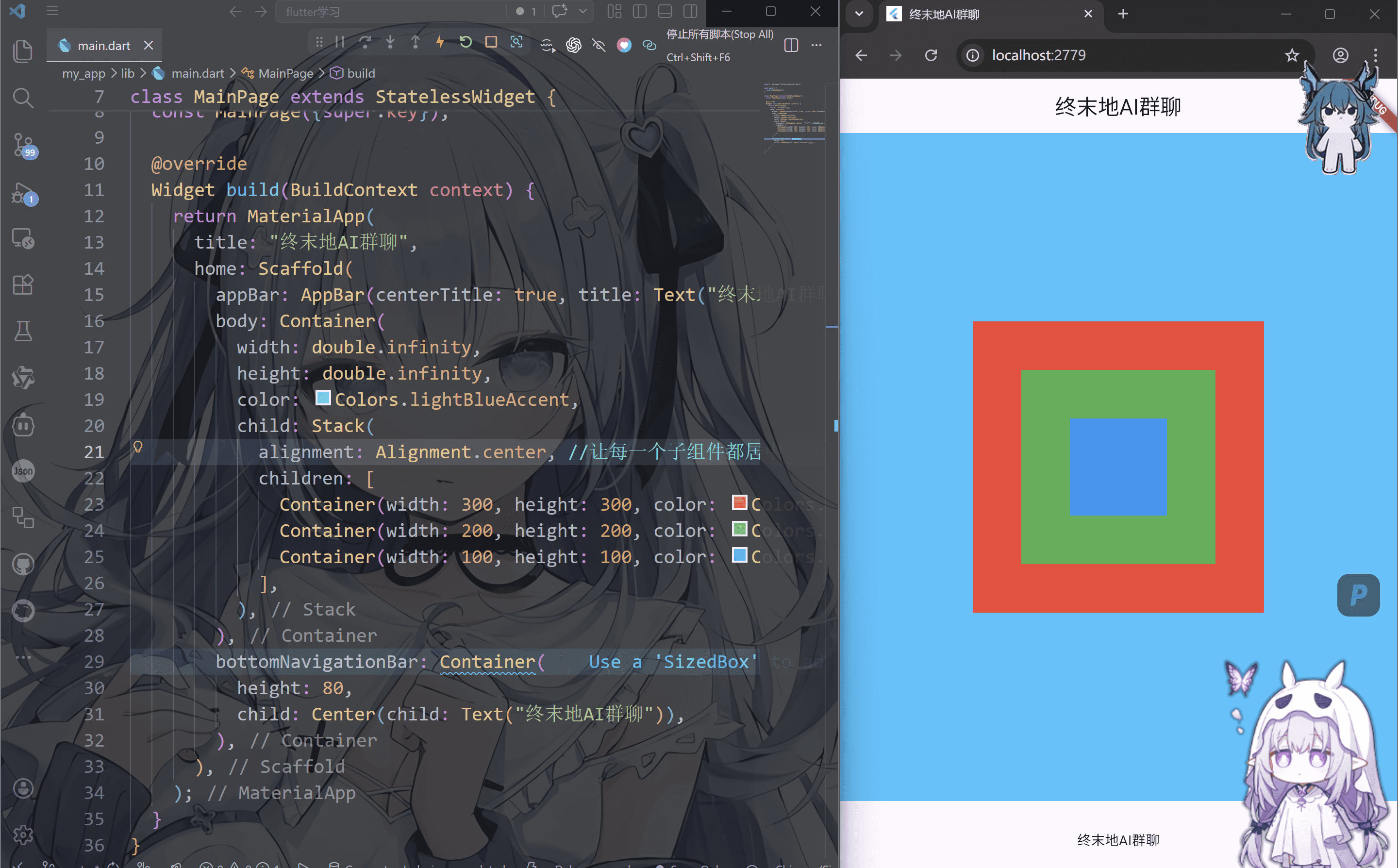
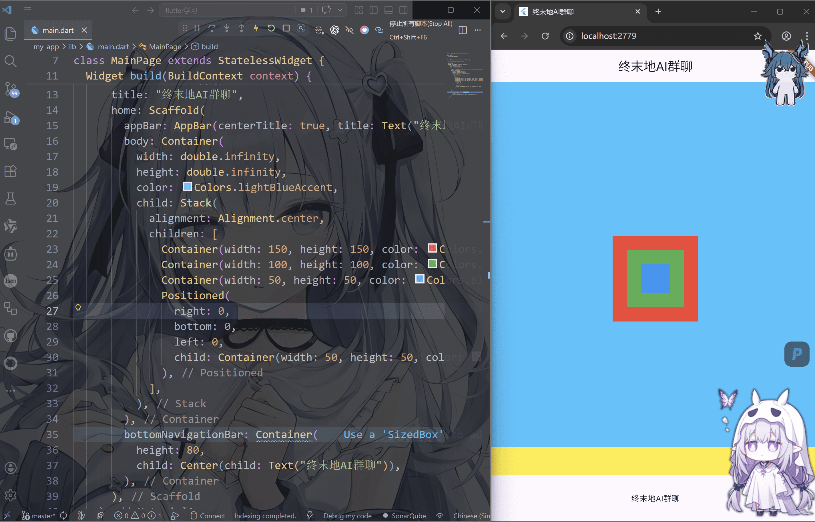
层叠布局-Stack/Positioned
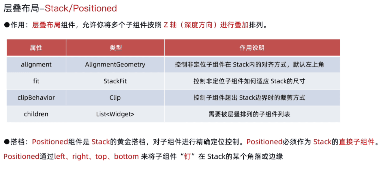
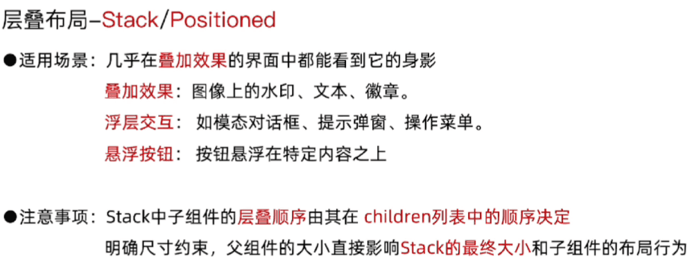
可以看出这个是层叠式的,一层叠一层
1
2
3
4
5
6
7
8
9
10
11
12
13
14
15
16
17
18
19
20
21
22
23
24
25
26
27
28
29
30
31
32
33
34
35
36
| import 'package:flutter/material.dart';
void main() {
runApp(MainPage());
}
class MainPage extends StatelessWidget {
const MainPage({super.key});
@override
Widget build(BuildContext context) {
return MaterialApp(
title: "终末地AI群聊",
home: Scaffold(
appBar: AppBar(centerTitle: true, title: Text("终末地AI群聊")),
body: Container(
width: double.infinity,
height: double.infinity,
color: Colors.lightBlueAccent,
child: Stack(
alignment: Alignment.center,
children: [
Container(width: 300, height: 300, color: Colors.red),
Container(width: 200, height: 200, color: Colors.green),
Container(width: 100, height: 100, color: Colors.blue),
],
),
),
bottomNavigationBar: Container(
height: 80,
child: Center(child: Text("终末地AI群聊")),
),
),
);
}
}
|
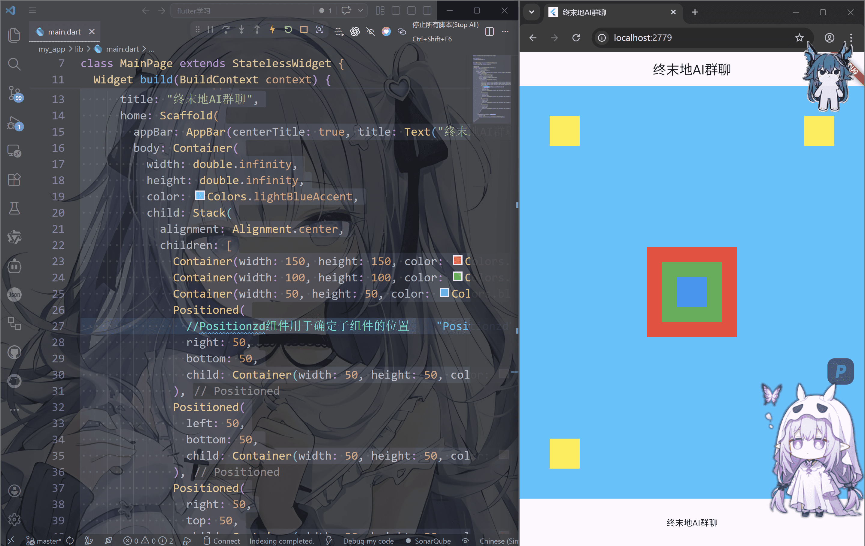
Positioned
1
2
3
4
5
6
7
8
9
10
11
12
13
14
15
16
17
18
19
20
21
22
23
24
25
26
27
28
29
30
31
32
33
34
35
36
37
38
39
40
41
42
43
44
45
46
47
48
49
50
51
52
53
54
55
56
57
| import 'package:flutter/material.dart';
void main() {
runApp(MainPage());
}
class MainPage extends StatelessWidget {
const MainPage({super.key});
@override
Widget build(BuildContext context) {
return MaterialApp(
title: "终末地AI群聊",
home: Scaffold(
appBar: AppBar(centerTitle: true, title: Text("终末地AI群聊")),
body: Container(
width: double.infinity,
height: double.infinity,
color: Colors.lightBlueAccent,
child: Stack(
alignment: Alignment.center,
children: [
Container(width: 150, height: 150, color: Colors.red),
Container(width: 100, height: 100, color: Colors.green),
Container(width: 50, height: 50, color: Colors.blue),
Positioned(
right: 50,
bottom: 50,
child: Container(width: 50, height: 50, color: Colors.yellow),
),
Positioned(
left: 50,
bottom: 50,
child: Container(width: 50, height: 50, color: Colors.yellow),
),
Positioned(
right: 50,
top: 50,
child: Container(width: 50, height: 50, color: Colors.yellow),
),
Positioned(
left: 50,
top: 50,
child: Container(width: 50, height: 50, color: Colors.yellow),
),
],
),
),
bottomNavigationBar: Container(
height: 80,
child: Center(child: Text("终末地AI群聊")),
),
),
);
}
}
|
还有一个很奇葩的玩法就是,我们在之前学习的padding这里可以用positioned来代替效果
首先先了解positioned的一个特性,如果我们同时输入上下左右四个方向
1
2
3
4
5
6
7
| Positioned(
right: 50,
top: 50,
bottom: 50,
left: 50,
child: Container(width: 50, height: 50, color: Colors.yellow),
),
|
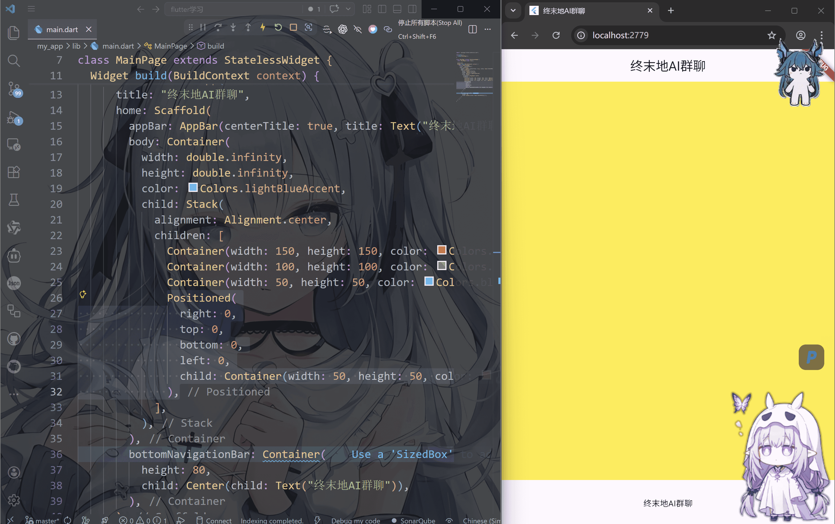
此时代码不会报错,而是子组件往四个方向延伸来覆盖容器
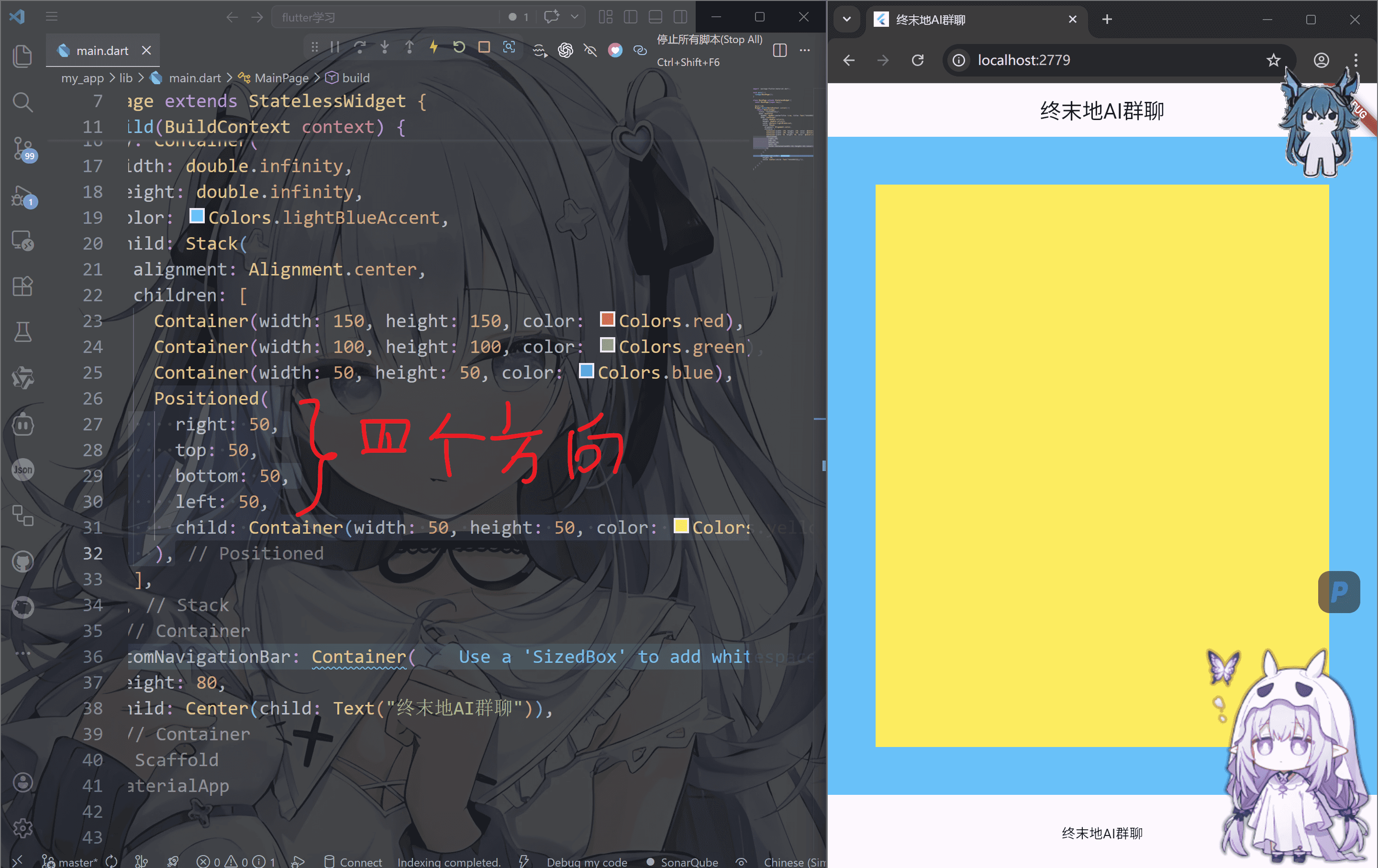
而且取值为0的时候甚至全部覆盖body
1
2
3
4
5
6
7
| Positioned(
right: 0,
top: 0,
bottom: 0,
left: 0,
child: Container(width: 50, height: 50, color: Colors.yellow),
),
|
同理,我们也可以制造单方向延伸的条
1
2
3
4
5
6
| Positioned(
right: 0,
bottom: 0,
left: 0,
child: Container(width: 50, height: 50, color: Colors.yellow),
),
|
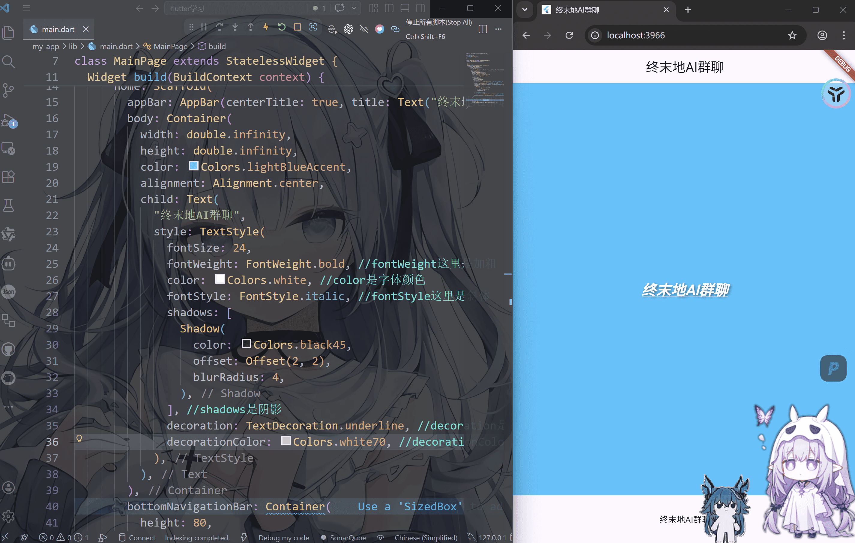
文本组件-Text
1
2
3
4
5
6
7
8
9
10
11
12
13
14
15
16
17
18
19
20
21
22
23
24
25
26
27
28
29
30
31
32
33
34
35
36
37
38
39
40
41
42
43
44
45
46
47
| import 'package:flutter/material.dart';
void main() {
runApp(MainPage());
}
class MainPage extends StatelessWidget {
const MainPage({super.key});
@override
Widget build(BuildContext context) {
return MaterialApp(
title: "终末地AI群聊",
home: Scaffold(
appBar: AppBar(centerTitle: true, title: Text("终末地AI群聊")),
body: Container(
width: double.infinity,
height: double.infinity,
color: Colors.lightBlueAccent,
alignment: Alignment.center,
child: Text(
"终末地AI群聊",
style: TextStyle(
fontSize: 24,
fontWeight: FontWeight.bold,
color: Colors.white,
fontStyle: FontStyle.italic,
shadows: [
Shadow(
color: Colors.black45,
offset: Offset(2, 2),
blurRadius: 4,
),
],
decoration: TextDecoration.underline,
decorationColor: Colors.white70,
),
),
),
bottomNavigationBar: Container(
height: 80,
child: Center(child: Text("终末地AI群聊")),
),
),
);
}
}
|
我们普通的文字排列是默认的换行
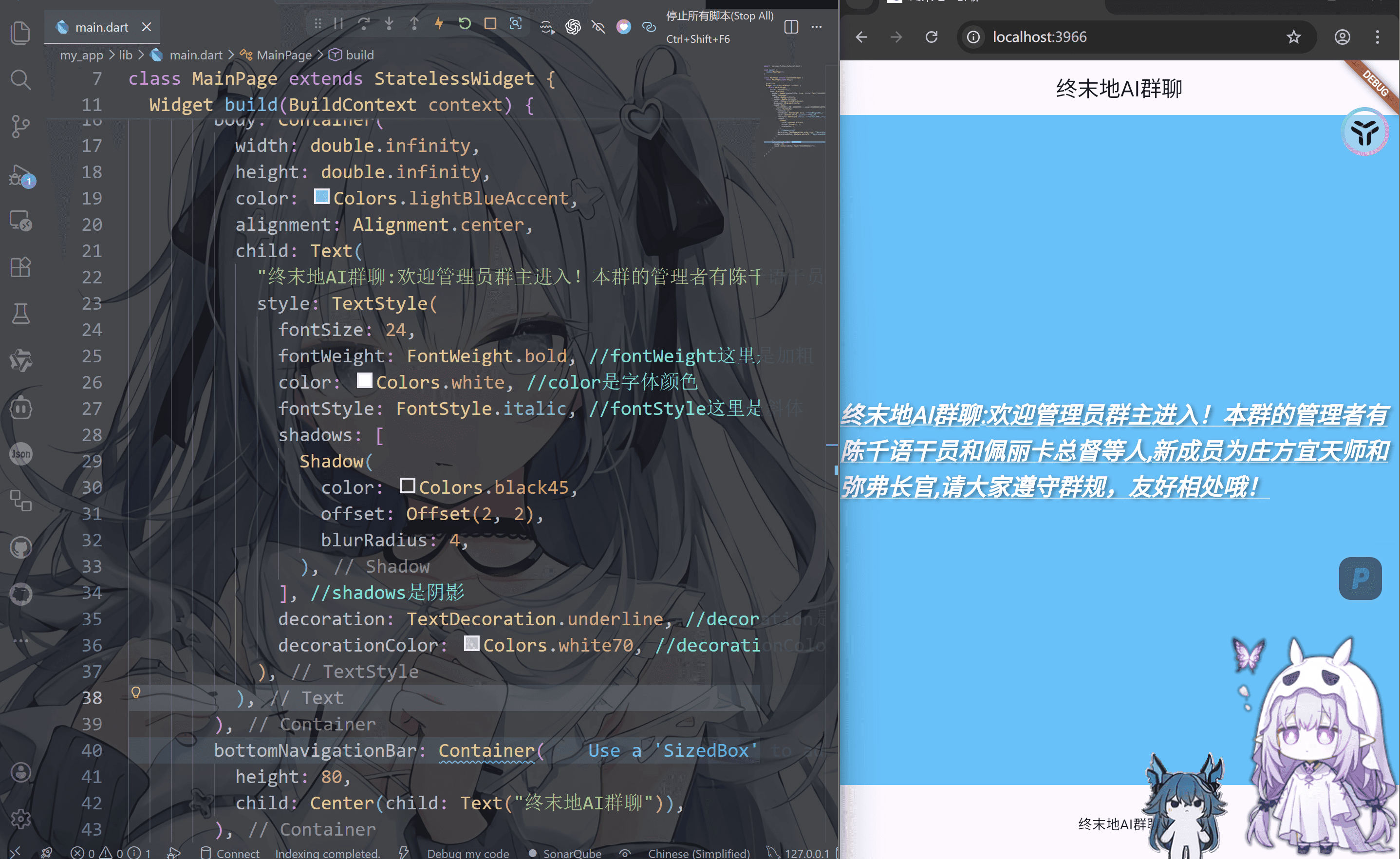
但是我们也可以指定显示的行号
1
2
3
4
5
6
7
8
9
10
11
12
13
14
15
16
17
18
19
20
21
22
23
24
25
26
27
28
29
30
31
32
33
34
35
36
37
38
39
40
41
42
43
44
45
46
47
48
49
| import 'package:flutter/material.dart';
void main() {
runApp(MainPage());
}
class MainPage extends StatelessWidget {
const MainPage({super.key});
@override
Widget build(BuildContext context) {
return MaterialApp(
title: "终末地AI群聊",
home: Scaffold(
appBar: AppBar(centerTitle: true, title: Text("终末地AI群聊")),
body: Container(
width: double.infinity,
height: double.infinity,
color: Colors.lightBlueAccent,
alignment: Alignment.center,
child: Text(
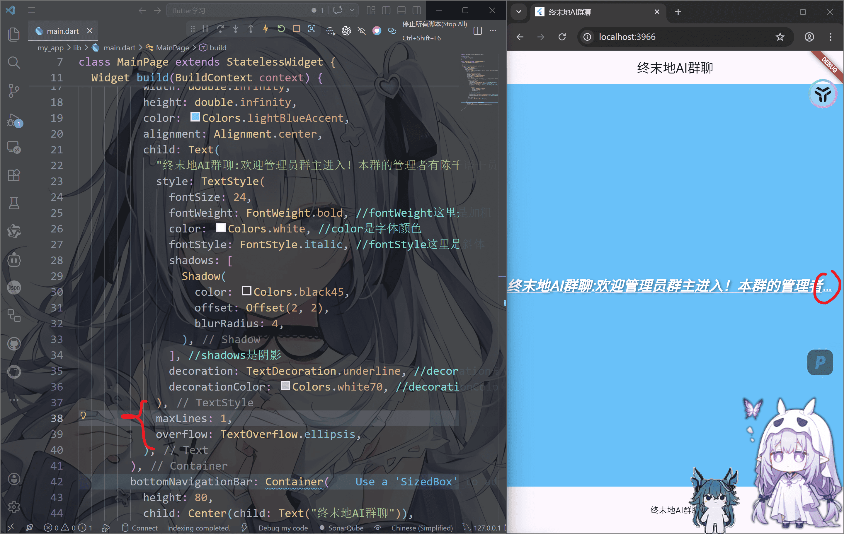
"终末地AI群聊:欢迎管理员群主进入!本群的管理者有陈千语干员和佩丽卡总督等人,新成员为庄方宜天师和弥弗长官,请大家遵守群规,友好相处哦!",
style: TextStyle(
fontSize: 24,
fontWeight: FontWeight.bold,
color: Colors.white,
fontStyle: FontStyle.italic,
shadows: [
Shadow(
color: Colors.black45,
offset: Offset(2, 2),
blurRadius: 4,
),
],
decoration: TextDecoration.underline,
decorationColor: Colors.white70,
),
maxLines: 1,
overflow: TextOverflow.ellipsis,
),
),
bottomNavigationBar: Container(
height: 80,
child: Center(child: Text("终末地AI群聊")),
),
),
);
}
}
|
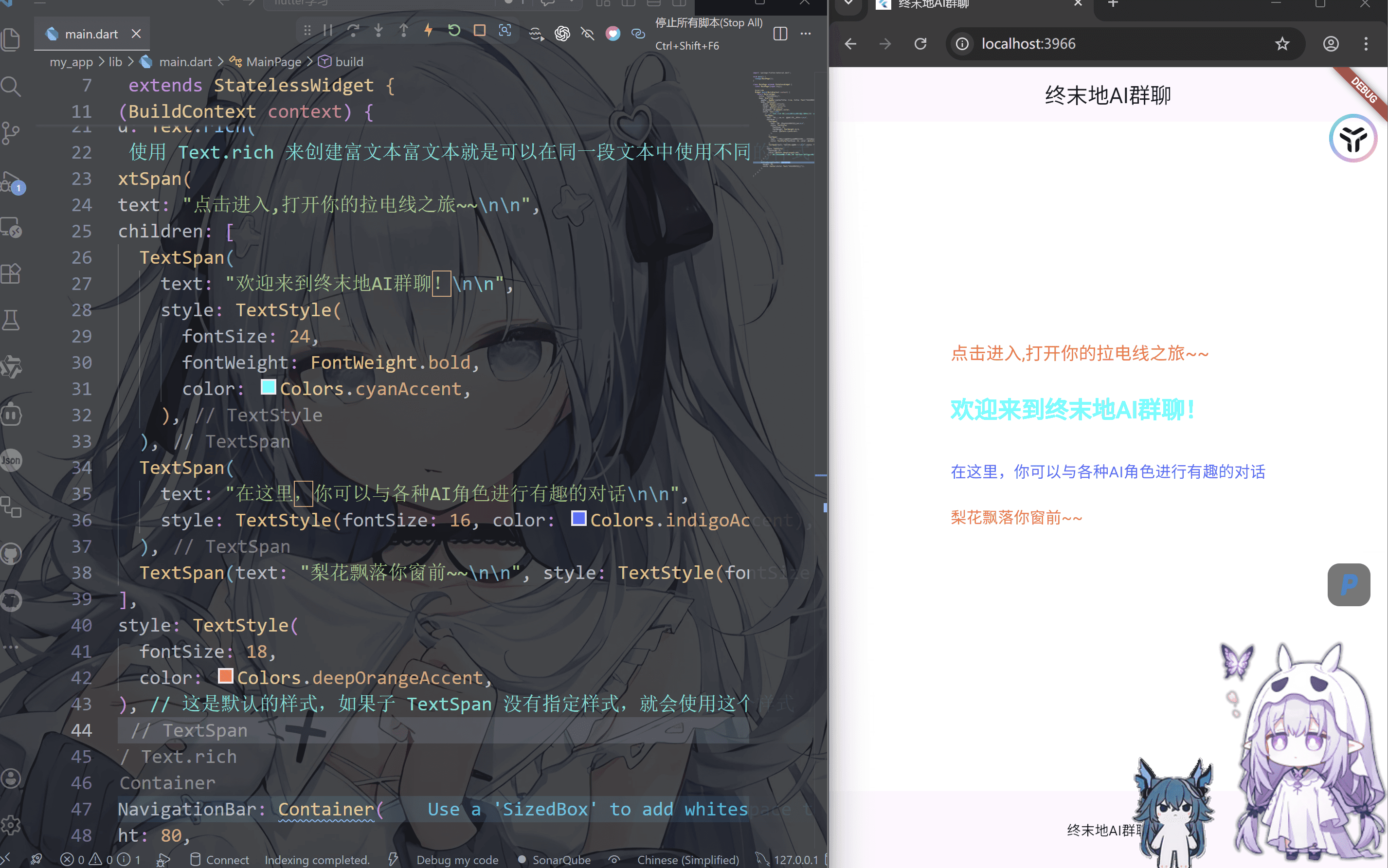
TextSpan
如果需要在同一段本中显示不同样式,可用Text.rich构造函数配合TextSpan来实现
1
2
3
4
5
6
7
8
9
10
11
12
13
14
15
16
17
18
19
20
21
22
23
24
25
26
27
28
29
30
31
32
33
34
35
36
37
38
39
40
41
42
43
44
45
46
47
48
49
50
51
52
53
54
| import 'package:flutter/material.dart';
void main() {
runApp(MainPage());
}
class MainPage extends StatelessWidget {
const MainPage({super.key});
@override
Widget build(BuildContext context) {
return MaterialApp(
title: "终末地AI群聊",
home: Scaffold(
appBar: AppBar(centerTitle: true, title: Text("终末地AI群聊")),
body: Container(
width: double.infinity,
height: double.infinity,
color: Colors.white,
alignment: Alignment.center,
child: Text.rich(
TextSpan(
text: "点击进入,打开你的拉电线之旅~~\n\n",
children: [
TextSpan(
text: "欢迎来到终末地AI群聊!\n\n",
style: TextStyle(
fontSize: 24,
fontWeight: FontWeight.bold,
color: Colors.cyanAccent,
),
),
TextSpan(
text: "在这里,你可以与各种AI角色进行有趣的对话\n\n",
style: TextStyle(fontSize: 16, color: Colors.indigoAccent),
),
TextSpan(text: "梨花飘落你窗前~~\n\n", style: TextStyle(fontSize: 16)),
],
style: TextStyle(
fontSize: 18,
color: Colors.deepOrangeAccent,
),
),
),
),
bottomNavigationBar: Container(
height: 80,
child: Center(child: Text("终末地AI群聊")),
),
),
);
}
}
|
图片组件-image
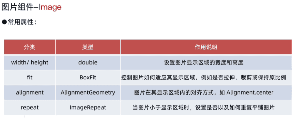
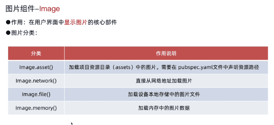
image.asset(本地资源)
pubspec.yaml启用图片文件夹
将资源assets功能启用
1
2
3
| assets:
- images/a_dot_burr.jpeg
- images/a_dot_ham.jpeg
|
这个需要一些配置
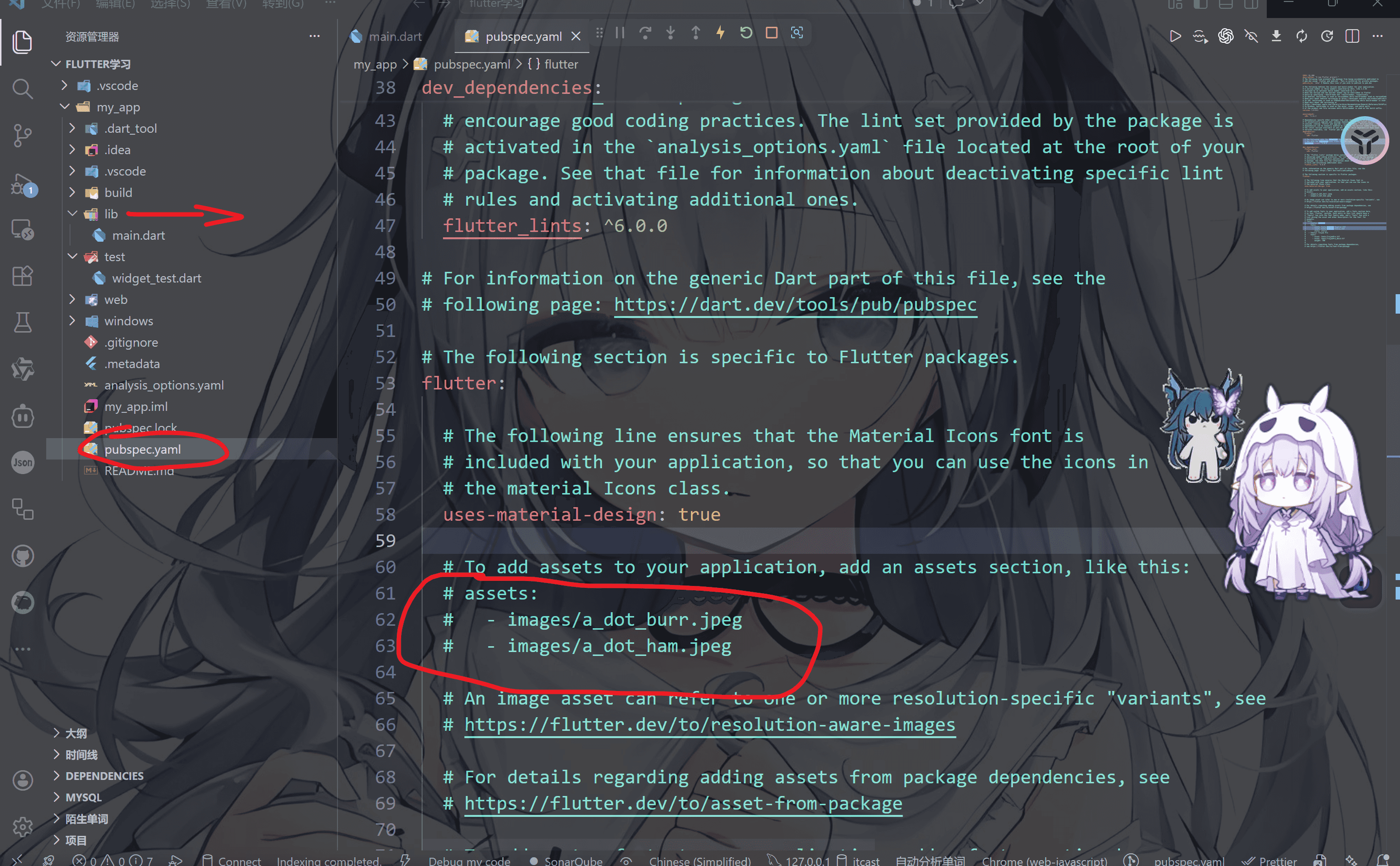
例如我们将图片放到这个images文件夹
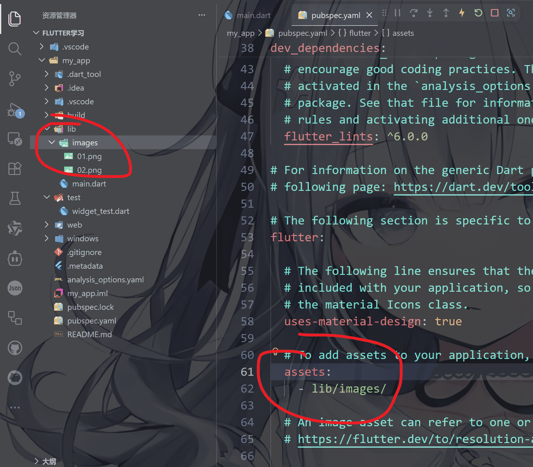
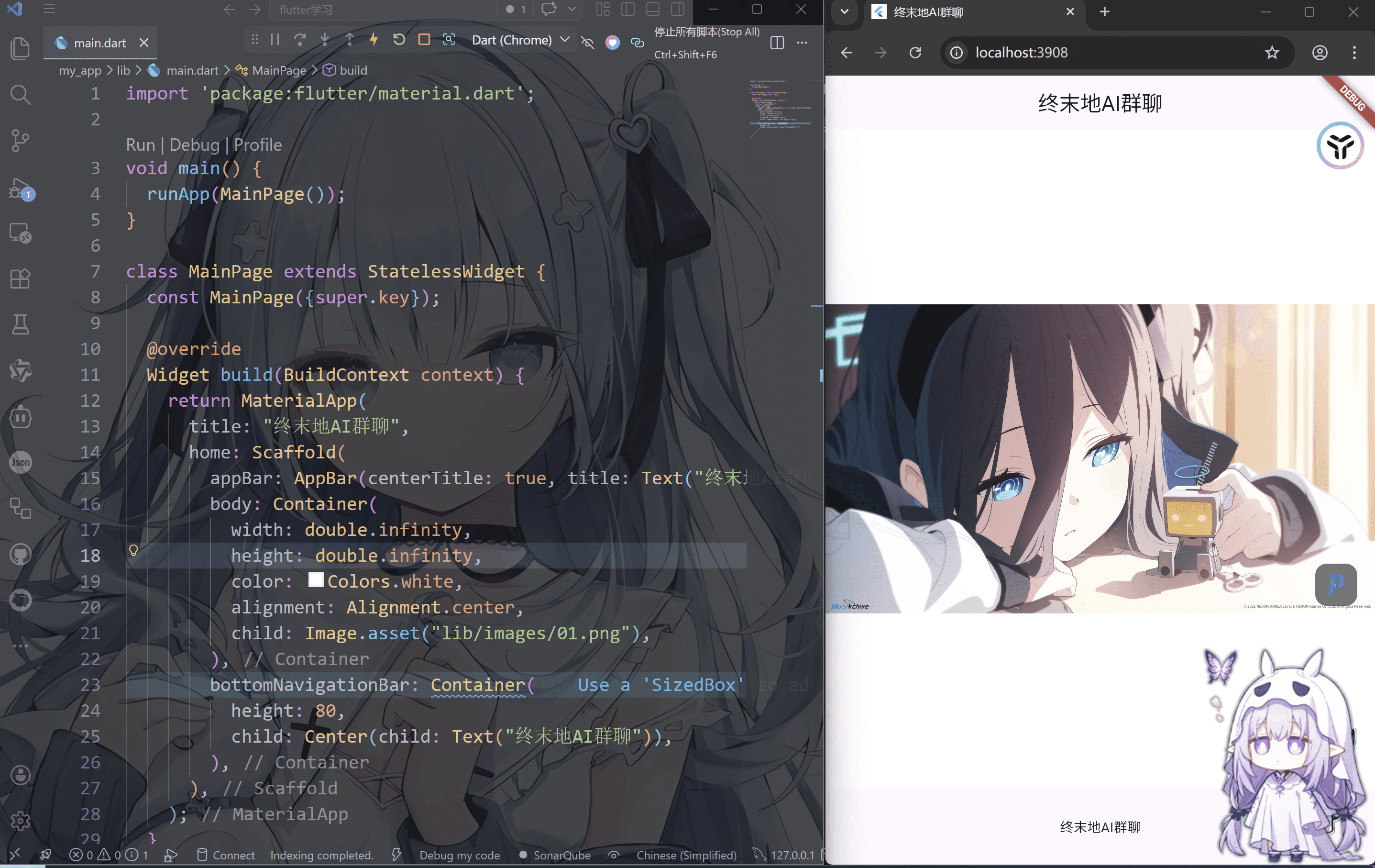
然后在main.dart中启用资源,同时重新run执行
1
2
3
4
5
6
7
8
9
10
11
12
13
14
15
16
17
18
19
20
21
22
23
24
25
26
27
28
29
30
| import 'package:flutter/material.dart';
void main() {
runApp(MainPage());
}
class MainPage extends StatelessWidget {
const MainPage({super.key});
@override
Widget build(BuildContext context) {
return MaterialApp(
title: "终末地AI群聊",
home: Scaffold(
appBar: AppBar(centerTitle: true, title: Text("终末地AI群聊")),
body: Container(
width: double.infinity,
height: double.infinity,
color: Colors.white,
alignment: Alignment.center,
child: Image.asset("lib/images/01.png"),
),
bottomNavigationBar: Container(
height: 80,
child: Center(child: Text("终末地AI群聊")),
),
),
);
}
}
|
当然也可以使用width和hight来控制图片的大小
1
| child: Image.asset("lib/images/01.png", width: 500, fit: BoxFit.contain),
|
fit属性
fit属性
这里fit 用的是 BoxFit 这个枚举,一共有 7种,每一种控制图片如何在给定空间里缩放/裁剪
1. BoxFit.fill
👉 强行拉伸填满
- 会变形 ❗(宽高比被破坏)
- 很少用,除非你不在意比例
2. BoxFit.contain
👉 完整显示图片
📌 类似:图片“缩小装进盒子”
3. BoxFit.cover ⭐(最常用)
👉 铺满容器
📌 类似:背景图常用(推荐)
4. BoxFit.fitWidth
👉 宽度填满
5. BoxFit.fitHeight
👉 高度填满
6. BoxFit.none
👉 不缩放
7. BoxFit.scaleDown
👉 只缩小,不放大
- 类似
contain
- 但如果图片本来就小,就不会放大
image.network(网络资源)
这个不需要在pubspec.yaml 直接使用就行了,把网址或者库粘贴进去
1
| Image.network('https://example.com/image.png')
|
但是问题是,这个东西需要联网,否则图片会显示不出来, 除此之外, Android/HarmonyOS/iOS使用Image.network需要配置网络权限
而且如果图片的源头断了也不会显示出来
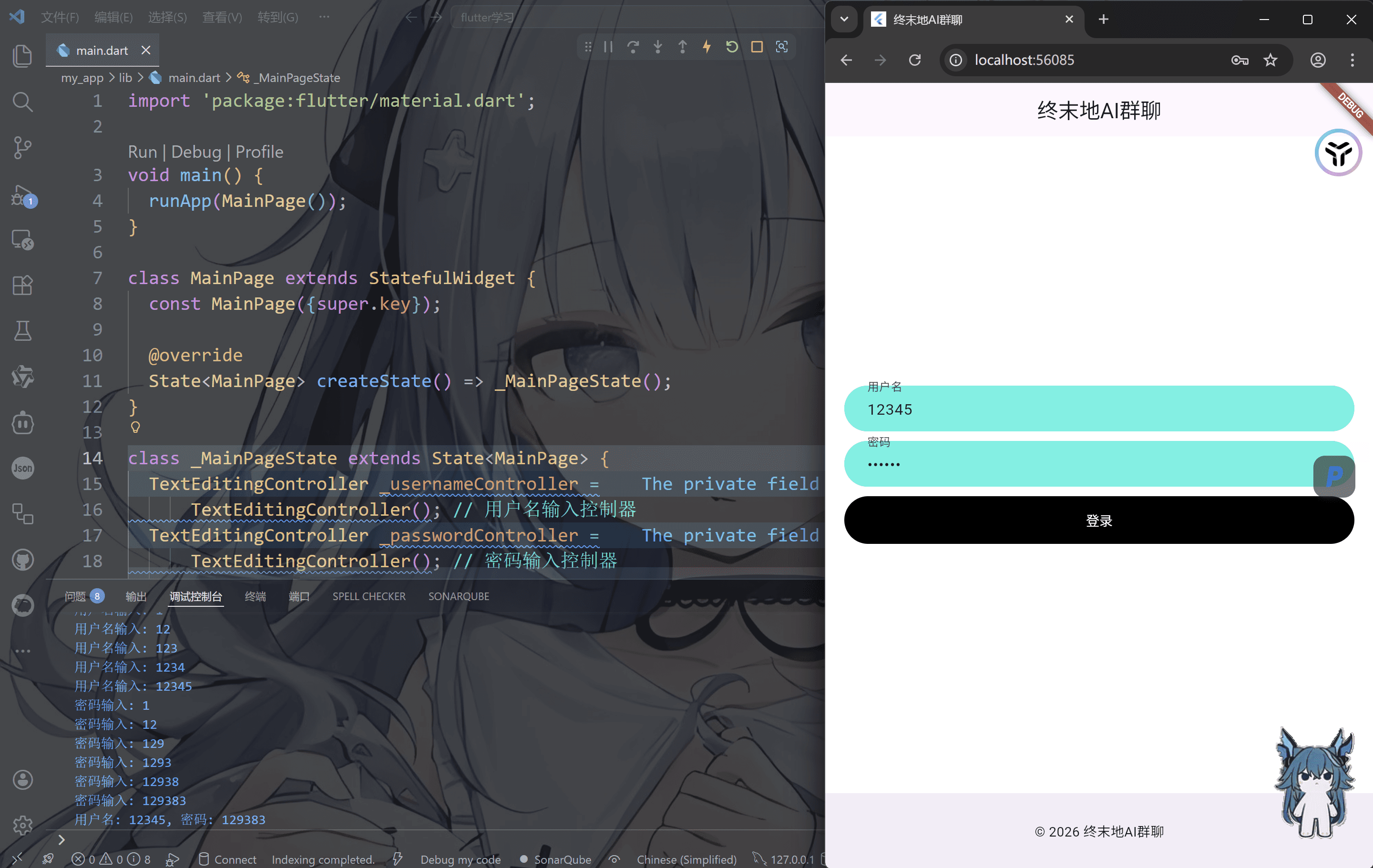
文本输入组件-TextField
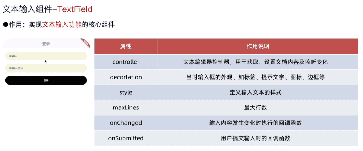
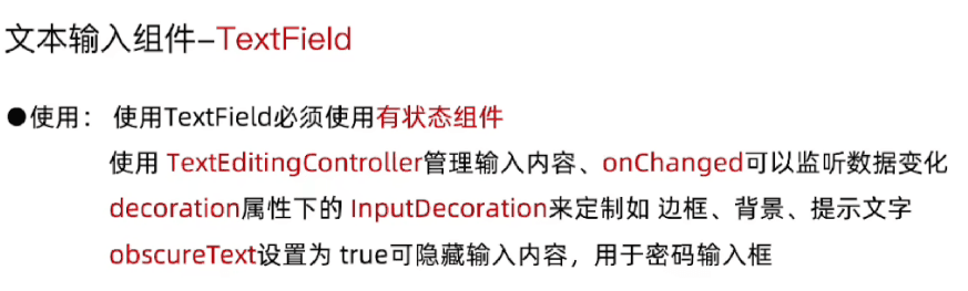
这里我们可以写一个登录界面,使用有状态组件StatefulWidget(因为这个是动态刷新的)
1
2
3
4
5
6
7
8
9
10
11
12
13
14
15
16
17
18
19
20
21
22
23
24
25
26
27
28
29
30
31
32
33
34
35
36
37
38
39
40
41
42
43
44
45
46
47
48
49
50
51
52
53
54
55
56
57
58
59
60
61
62
63
64
65
66
67
68
69
70
71
72
73
74
75
76
77
78
79
80
81
82
83
84
85
86
87
88
89
90
91
92
93
94
95
96
97
98
99
100
101
102
103
104
| import 'package:flutter/material.dart';
void main() {
runApp(MainPage());
}
class MainPage extends StatefulWidget {
const MainPage({super.key});
@override
State<MainPage> createState() => _MainPageState();
}
class _MainPageState extends State<MainPage> {
TextEditingController _usernameController =
TextEditingController();
TextEditingController _passwordController =
TextEditingController();
@override
Widget build(BuildContext context) {
return MaterialApp(
title: "终末地AI群聊",
home: Scaffold(
appBar: AppBar(centerTitle: true, title: Text("终末地AI群聊")),
body: Container(
padding: EdgeInsets.all(20),
color: Colors.white,
child: Column(
mainAxisAlignment: MainAxisAlignment.center,
children: [
TextField(
controller: _usernameController,
onChanged: (value) => print("用户名输入: $value"),
onSubmitted: (value) => print("用户名提交: $value"),
decoration: InputDecoration(
contentPadding: EdgeInsets.only(
left: 20,
),
hintText: "请输入用户名",
fillColor: const Color.fromARGB(255, 85, 242, 227),
filled: true,
labelText: "用户名",
border: OutlineInputBorder(
borderSide: BorderSide.none,
borderRadius: BorderRadius.circular(25),
),
),
),
SizedBox(height: 10),
TextField(
controller: _passwordController,
obscureText: true,
onChanged: (value) => print("密码输入: $value"),
onSubmitted: (value) => print("密码提交: $value"),
decoration: InputDecoration(
contentPadding: EdgeInsets.only(
left: 20,
),
hintText: "请输入密码",
fillColor: const Color.fromARGB(255, 85, 242, 227),
filled: true,
labelText: "密码",
border: OutlineInputBorder(
borderSide: BorderSide.none,
borderRadius: BorderRadius.circular(25),
),
),
),
SizedBox(height: 10),
Container(
height: 50,
width: double.infinity,
decoration: BoxDecoration(
color: Colors.black,
borderRadius: BorderRadius.circular(25),
),
child: TextButton(
onPressed: () {
print(
"用户名: ${_usernameController.text}, 密码: ${_passwordController.text}",
);
},
child: Text("登录", style: TextStyle(color: Colors.white)),
),
),
],
),
),
bottomNavigationBar: BottomAppBar(
child: Container(
height: 50.0,
child: Center(child: Text("© 2026 终末地AI群聊")),
),
),
),
);
}
}
|
常用滚动组件
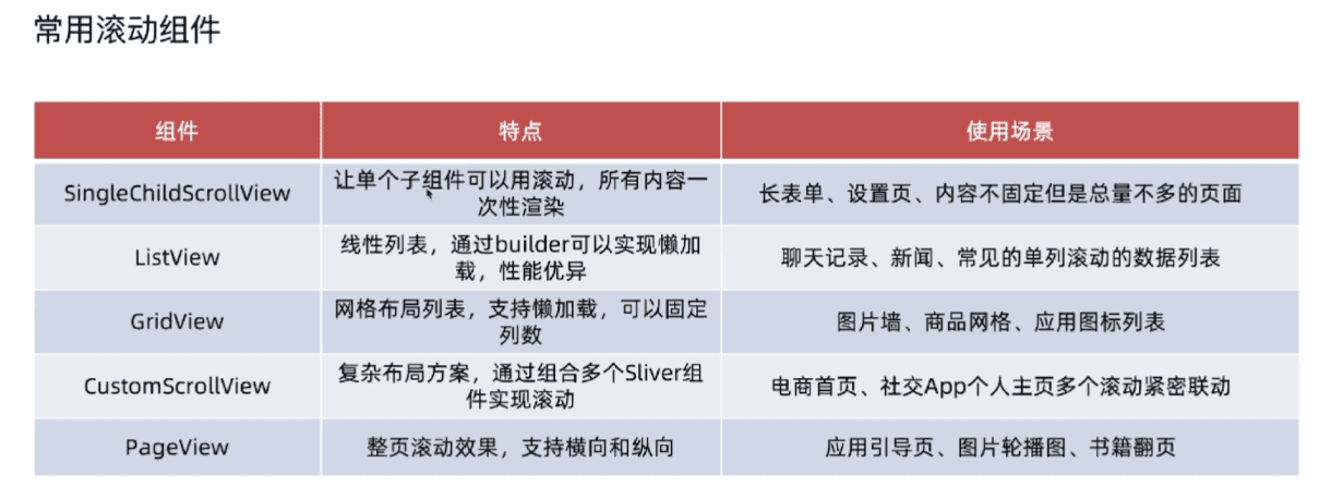
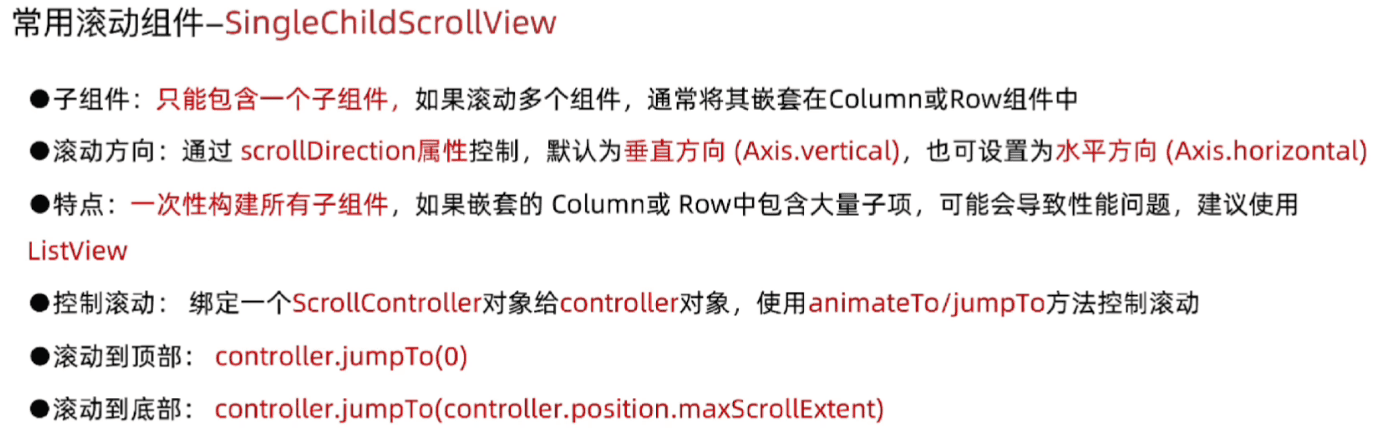
包裹个组件,让单个组件具备滚动能
1
2
3
4
5
6
7
8
9
10
11
12
13
14
15
16
17
18
19
20
21
22
23
24
25
26
27
28
29
30
31
32
33
34
35
36
37
38
39
40
41
42
43
44
45
46
47
48
49
50
51
52
53
54
55
56
| import 'package:flutter/material.dart';
void main() {
runApp(MainPage());
}
class MainPage extends StatefulWidget {
const MainPage({super.key});
@override
State<MainPage> createState() => _MainPageState();
}
class _MainPageState extends State<MainPage> {
TextEditingController _usernameController =
TextEditingController();
TextEditingController _passwordController =
TextEditingController();
@override
Widget build(BuildContext context) {
return MaterialApp(
title: "终末地AI群聊",
home: Scaffold(
appBar: AppBar(centerTitle: true, title: Text("终末地AI群聊")),
body: SingleChildScrollView(
child: Column(
children: List.generate(100, (index) {
return Container(
margin: EdgeInsets.only(top: 10),
width: double.infinity,
color: Colors.lightBlueAccent,
height: 100,
child: Text(
"这是第${index + 1}条消息",
style: TextStyle(
color: Colors.white,
fontSize: 20,
fontWeight: FontWeight.bold,
),
),
alignment: Alignment.center,
);
}),
),
),
bottomNavigationBar: BottomAppBar(
child: Container(
height: 50.0,
child: Center(child: Text("© 2026 终末地AI群聊")),
),
),
),
);
}
}
|
然后我们可以增加一个回到首页的按钮
1
2
3
4
5
6
7
8
9
10
11
12
13
14
15
16
17
18
19
20
21
22
23
24
25
26
27
28
29
30
31
32
33
34
35
36
37
38
39
40
41
42
43
44
45
46
47
48
49
50
51
52
53
54
55
56
57
58
59
60
61
62
63
64
65
66
67
68
69
70
71
72
73
74
75
76
77
78
79
80
81
82
83
84
85
86
87
88
89
90
91
92
93
94
95
96
97
98
99
100
101
102
103
104
105
106
107
108
109
110
111
112
113
114
115
116
117
118
119
120
121
122
123
124
125
126
127
128
129
| import 'package:flutter/material.dart';
void main() {
runApp(MainPage());
}
class MainPage extends StatefulWidget {
const MainPage({super.key});
@override
State<MainPage> createState() => _MainPageState();
}
class _MainPageState extends State<MainPage> {
ScrollController _scrollController = ScrollController();
@override
Widget build(BuildContext context) {
return MaterialApp(
title: "终末地AI群聊",
home: Scaffold(
appBar: AppBar(centerTitle: true, title: Text("终末地AI群聊")),
body: Stack(
children: [
SingleChildScrollView(
controller: _scrollController,
padding: EdgeInsets.all(20),
child: Column(
children: List.generate(100, (index) {
return Container(
margin: EdgeInsets.only(top: 10),
width: double.infinity,
color: Colors.lightBlueAccent,
height: 100,
child: Text(
"这是第${index + 1}条消息",
style: TextStyle(
color: Colors.white,
fontSize: 20,
fontWeight: FontWeight.bold,
),
),
alignment: Alignment.center,
);
}),
),
),
Positioned(
right: 10,
bottom: 10,
child: GestureDetector(
onTap: () {
print("回到顶部按钮已被点击");
_scrollController.animateTo(
0,
duration: Duration(seconds: 1),
curve: Curves.ease,
);
},
child: Container(
decoration: BoxDecoration(
borderRadius: BorderRadius.circular(25),
color: Colors.cyanAccent,
),
width: 70,
height: 70,
alignment: Alignment.center,
child: Text(
"回到顶部",
style: TextStyle(
fontSize: 15,
color: Colors.white,
fontWeight: FontWeight.bold,
),
),
),
),
),
Positioned(
right: 10,
top: 10,
child: GestureDetector(
onTap: () {
print("回到底部按钮已被点击");
_scrollController.animateTo(
_scrollController.position.maxScrollExtent,
duration: Duration(seconds: 1),
curve: Curves.ease,
);
},
child: Container(
decoration: BoxDecoration(
borderRadius: BorderRadius.circular(25),
color: Colors.cyanAccent,
),
width: 70,
height: 70,
alignment: Alignment.center,
child: Text(
"回到底部",
style: TextStyle(
fontSize: 15,
color: Colors.white,
fontWeight: FontWeight.bold,
),
),
),
),
),
],
),
bottomNavigationBar: BottomAppBar(
child: Container(
height: 50.0,
child: Center(child: Text("© 2026 终末地AI群聊")),
),
),
),
);
}
}
|
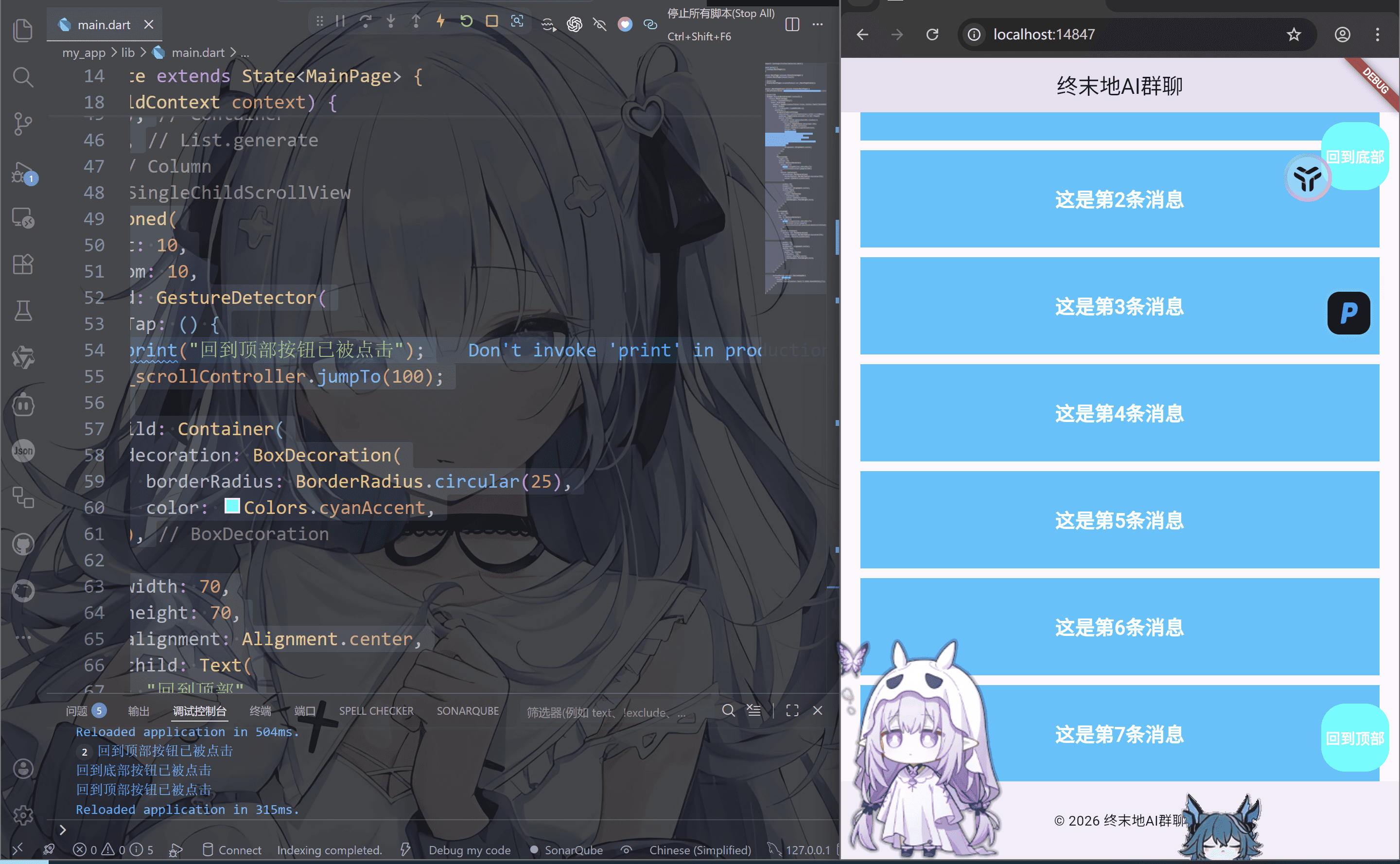
其中这里面涉及的两个方法—jumpTo和animateTo这里细说一下
jumpTo(直接跳转)
1
| _scrollController.jumpTo(0);
|
本质:瞬间跳转到指定滚动位置(没有动画)
参数只有一个
| 值 |
含义 |
0 |
顶部 |
_scrollController.position.maxScrollExtent |
底部 |
| 任意数字 |
指定位置 |
特点
- 不会有任何过渡效果
- 立即生效
- 用户体验比较“生硬”
- 适合:
举例
1
2
3
| _scrollController.jumpTo(
_scrollController.position.maxScrollExtent,
);
|
效果就是: 一点击直接“啪”一下到底,没有滚动过程
animateTo(动画平滑)
1
2
3
4
5
| animateTo(
double offset, {
required Duration duration,
required Curve curve,
})
|
第一个参数offset(滚动位置)
| 值 |
含义 |
0 |
顶部 |
_scrollController.position.maxScrollExtent |
底部 |
| 任意数字 |
指定位置 |
这个和jumpTo是一样的
第二个参数duration(动画时长)
即动画持续时间为1秒
你可以这样写:
1
2
| Duration(milliseconds: 300)
Duration(seconds: 2)
|
效果:
第三个参数curves(动画曲线)
控制动画“运动方式”(非常重要)
常见曲线:
| 曲线 |
效果 |
Curves.linear |
匀速(最死板) |
Curves.ease |
平滑(推荐) |
Curves.easeIn |
先慢后快 |
Curves.easeOut |
先快后慢 |
Curves.easeInOut |
两头慢中间快 |
Curves.bounceIn |
弹跳进入(你现在用的) |
Curves.elasticOut |
弹簧效果 |
ListView

children 模式
这个也是最普通的模式
1
2
3
4
5
6
7
8
9
10
11
12
13
14
15
16
17
18
19
20
21
22
23
24
25
26
27
28
29
30
31
32
33
34
35
36
37
38
39
40
41
42
43
44
45
46
47
48
49
50
51
| import 'package:flutter/material.dart';
void main() {
runApp(MainPage());
}
class MainPage extends StatefulWidget {
const MainPage({super.key});
@override
State<MainPage> createState() => _MainPageState();
}
class _MainPageState extends State<MainPage> {
@override
Widget build(BuildContext context) {
return MaterialApp(
title: "终末地AI群聊",
home: Scaffold(
appBar: AppBar(centerTitle: true, title: Text("终末地AI群聊")),
body: ListView(
children: List.generate(100, (index) {
return Container(
margin: EdgeInsets.only(top: 10),
width: double.infinity,
color: Colors.lightBlueAccent,
height: 100,
child: Text(
"这是第${index + 1}条消息",
style: TextStyle(
color: Colors.white,
fontSize: 20,
fontWeight: FontWeight.bold,
),
),
alignment: Alignment.center,
);
}),
),
bottomNavigationBar: BottomAppBar(
child: Container(
height: 50.0,
child: Center(child: Text("© 2026 终末地AI群聊")),
),
),
),
);
}
}
|
builder模式
builder模式就是用来处理长列表或动态数据的首选和推荐方式
方式为接受一个itemBuilder回调函数来按需构建列表项,通过itemCount控制列表长度
特点是按需构建,不会在初始化时将所有列表项都创建,而是根据用户的滚动行为,动态的创建和销毁列表项
使用方式为ListView.builder(itemBuilder: ListView,itemCount: itemCount)
1
2
3
| itemBuilder: (context, index) {
return Text("$index");
}
|
| 参数 |
意思 |
| context |
当前上下文 |
| index |
第几个 |
1
2
3
4
5
6
7
8
9
10
11
12
13
14
15
16
17
18
19
20
21
22
23
24
25
26
27
28
29
30
31
32
33
34
35
36
37
38
39
40
41
42
43
44
45
46
47
48
49
50
51
52
| import 'package:flutter/material.dart';
void main() {
runApp(MainPage());
}
class MainPage extends StatefulWidget {
const MainPage({super.key});
@override
State<MainPage> createState() => _MainPageState();
}
class _MainPageState extends State<MainPage> {
@override
Widget build(BuildContext context) {
return MaterialApp(
title: "终末地AI群聊",
home: Scaffold(
appBar: AppBar(centerTitle: true, title: Text("终末地AI群聊")),
body: ListView.builder(
itemCount: 100,
itemBuilder: (BuildContext context, int index) {
return Container(
margin: EdgeInsets.only(top: 10),
width: double.infinity,
color: Colors.lightBlueAccent,
height: 100,
child: Text(
"这是第${index + 1}条消息",
style: TextStyle(
color: Colors.white,
fontSize: 20,
fontWeight: FontWeight.bold,
),
),
alignment: Alignment.center,
);
},
),
bottomNavigationBar: BottomAppBar(
child: Container(
height: 50.0,
child: Center(child: Text("© 2026 终末地AI群聊")),
),
),
),
);
}
}
|
separated模式
作用就是在ListView.builder的基础上,额外提供了构建分割线的能力
方式就是需要同时提供itemBuilder , separatorBuilder ,itemCount三个属性
使用方式为 ListView.separated(itemBuilder: itemBuilder, separatorBuilder: separatorBuilder, itemCount: itemCount)
三个参数分别为要构建的组件,组件之间的分割组件,和构建数量
1
2
3
4
5
6
7
8
9
10
11
12
13
14
15
16
17
18
19
20
21
22
23
24
25
26
27
28
29
30
31
32
33
34
35
36
37
38
39
40
41
42
43
44
45
46
47
48
49
50
51
52
53
54
55
| import 'package:flutter/material.dart';
void main() {
runApp(MainPage());
}
class MainPage extends StatefulWidget {
const MainPage({super.key});
@override
State<MainPage> createState() => _MainPageState();
}
class _MainPageState extends State<MainPage> {
@override
Widget build(BuildContext context) {
return MaterialApp(
title: "终末地AI群聊",
home: Scaffold(
appBar: AppBar(centerTitle: true, title: Text("终末地AI群聊")),
body: ListView.separated(
itemBuilder: (BuildContext context, int index) {
return Container(
margin: EdgeInsets.only(top: 10),
width: double.infinity,
color: Colors.lightBlueAccent,
height: 100,
child: Text(
"这是第${index + 1}条消息",
style: TextStyle(
color: Colors.white,
fontSize: 20,
fontWeight: FontWeight.bold,
),
),
alignment: Alignment.center,
);
},
separatorBuilder: (BuildContext context, int index) {
return SizedBox(height: 5);
},
itemCount: 100,
),
bottomNavigationBar: BottomAppBar(
child: Container(
height: 50.0,
child: Center(child: Text("© 2026 终末地AI群聊")),
),
),
),
);
}
}
|
GridView
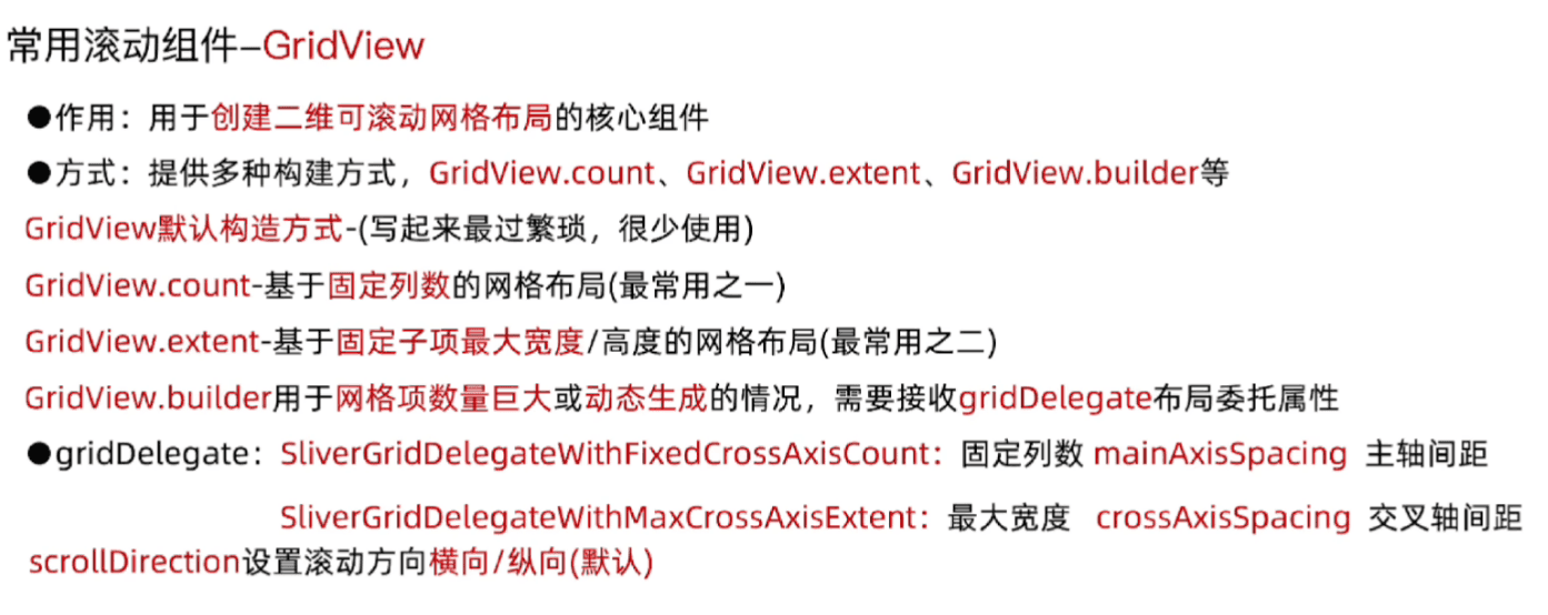
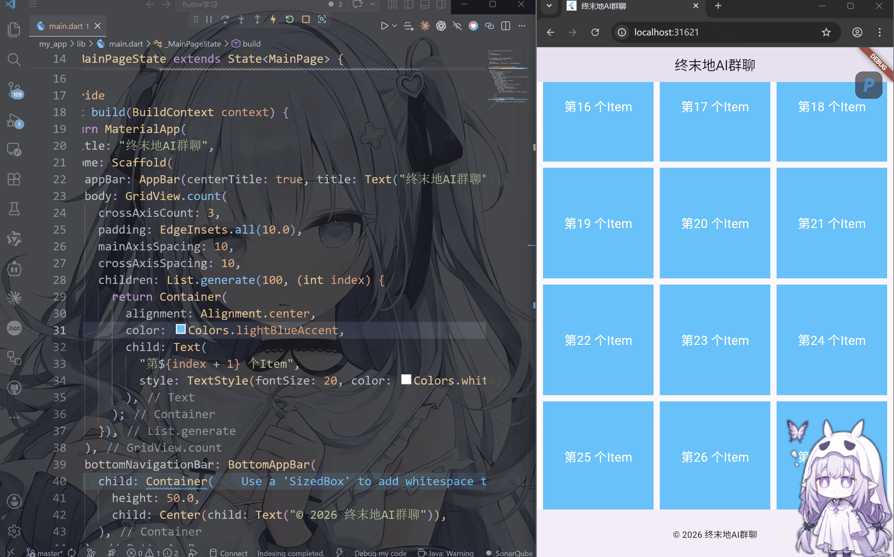
GridView.count
作用: 使用GridView.count创建固定列数网络
使用方式为 GridView.count(crossAxisCount: crossAxisCount)
1
2
3
4
5
6
7
8
9
10
11
12
13
14
15
16
17
18
19
20
21
22
23
24
25
26
27
28
29
30
31
32
33
34
35
36
37
38
39
40
41
42
43
44
45
46
47
| import 'package:flutter/material.dart';
void main() {
runApp(MainPage());
}
class MainPage extends StatefulWidget {
const MainPage({super.key});
@override
State<MainPage> createState() => _MainPageState();
}
class _MainPageState extends State<MainPage> {
@override
Widget build(BuildContext context) {
return MaterialApp(
title: "终末地AI群聊",
home: Scaffold(
appBar: AppBar(centerTitle: true, title: Text("终末地AI群聊")),
body: GridView.count(
crossAxisCount: 3,
padding: EdgeInsets.all(10.0),
mainAxisSpacing: 10,
crossAxisSpacing: 10,
children: List.generate(100, (int index) {
return Container(
alignment: Alignment.center,
color: Colors.lightBlueAccent,
child: Text(
"第${index + 1} 个Item",
style: TextStyle(fontSize: 20, color: Colors.white),
),
);
}),
),
bottomNavigationBar: BottomAppBar(
child: Container(
height: 50.0,
child: Center(child: Text("© 2026 终末地AI群聊")),
),
),
),
);
}
}
|
想想这个可以用来干什么? 没错! 可以制作相册!你打开你的手机相册看看是不是差不多的
还可以这么干
我们这个默认情况下是竖直向下滚动的也就是crollDirection: Axis.vertical
还可以这样实现横向滚动翻阅
1
2
3
4
5
6
7
8
9
10
11
12
13
14
15
16
17
18
19
20
21
22
23
24
25
26
27
28
29
30
31
32
33
34
35
36
37
38
39
40
41
42
43
44
45
46
47
48
49
| import 'package:flutter/material.dart';
void main() {
runApp(MainPage());
}
class MainPage extends StatefulWidget {
const MainPage({super.key});
@override
State<MainPage> createState() => _MainPageState();
}
class _MainPageState extends State<MainPage> {
ScrollController _scrollController = ScrollController();
@override
Widget build(BuildContext context) {
return MaterialApp(
title: "终末地AI群聊",
home: Scaffold(
appBar: AppBar(centerTitle: true, title: Text("终末地AI群聊")),
body: GridView.count(
scrollDirection: Axis.horizontal,
crossAxisCount: 3,
padding: EdgeInsets.all(10.0),
mainAxisSpacing: 10,
crossAxisSpacing: 10,
children: List.generate(100, (int index) {
return Container(
alignment: Alignment.center,
color: Colors.lightBlueAccent,
child: Text(
"第${index + 1} 个Item",
style: TextStyle(fontSize: 20, color: Colors.white),
),
);
}),
),
bottomNavigationBar: BottomAppBar(
child: Container(
height: 50.0,
child: Center(child: Text("© 2026 终末地AI群聊")),
),
),
),
);
}
}
|
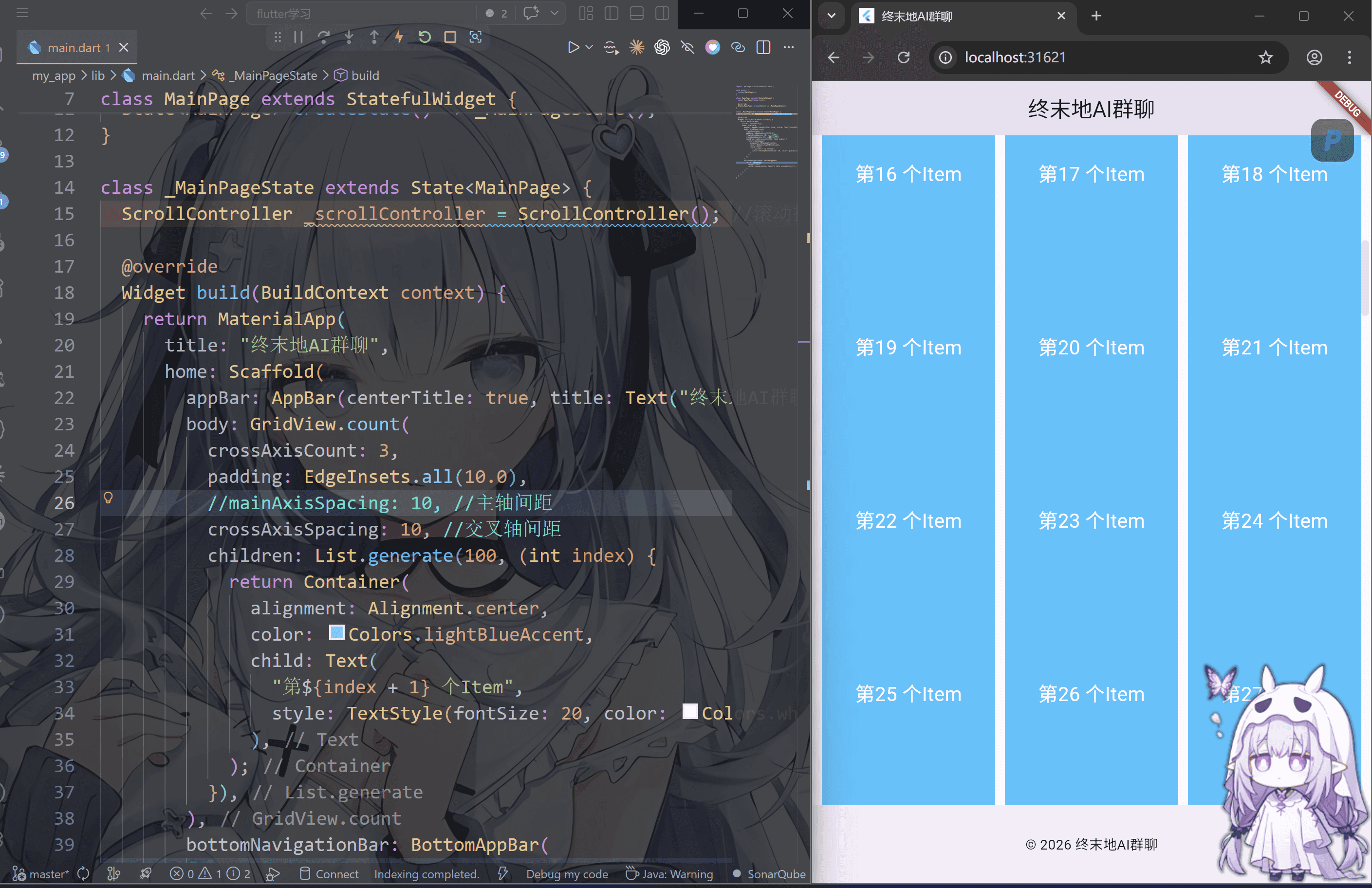
GridView.count以列数为优先。指定格多少列,Flutter动计算列的宽度,在空间内均匀排列
GridView.extent
这个很有意思,因为这个拖动改变窗口大小的时候,组件会自适应位置,就像模态窗口一样
依旧这个默认的是 scrollDirection: Axis.vertical模式
1
2
3
4
5
6
7
8
9
10
11
12
13
14
15
16
17
18
19
20
21
22
23
24
25
26
27
28
29
30
31
32
33
34
35
36
37
38
39
40
41
42
43
44
45
46
47
48
49
| import 'package:flutter/material.dart';
void main() {
runApp(MainPage());
}
class MainPage extends StatefulWidget {
const MainPage({super.key});
@override
State<MainPage> createState() => _MainPageState();
}
class _MainPageState extends State<MainPage> {
@override
Widget build(BuildContext context) {
return MaterialApp(
title: "终末地AI群聊",
home: Scaffold(
appBar: AppBar(centerTitle: true, title: Text("终末地AI群聊")),
body: GridView.extent(
maxCrossAxisExtent: 100,
mainAxisSpacing: 10,
crossAxisSpacing: 10,
scrollDirection: Axis.vertical,
padding: EdgeInsets.all(10),
children: List.generate(100, (int index) {
return Container(
alignment: Alignment.center,
color: Colors.lightBlueAccent,
child: Text(
"第${index + 1} 个",
style: TextStyle(fontSize: 20, color: Colors.white),
),
);
}),
),
bottomNavigationBar: BottomAppBar(
child: Container(
height: 50.0,
child: Center(child: Text("© 2026 终末地AI群聊")),
),
),
),
);
}
}
|
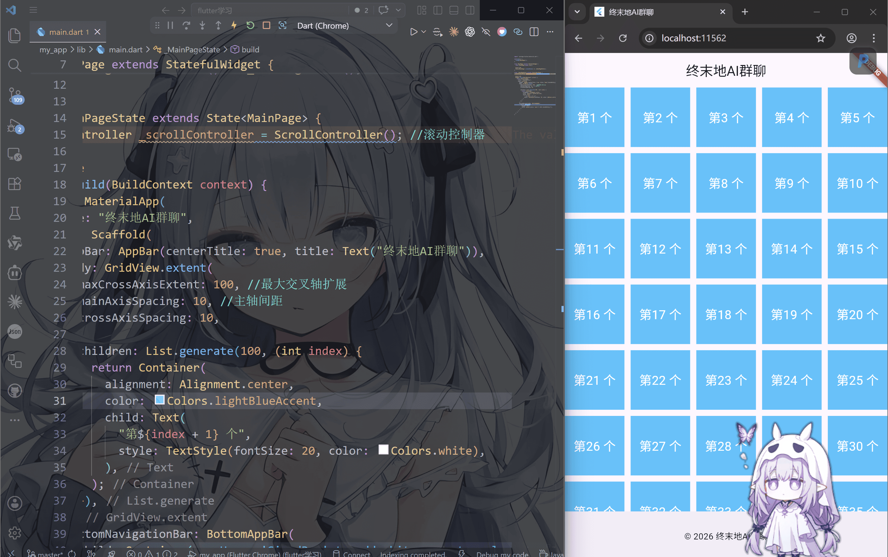
GridView.extent通过maxCrossAxisExtent设置子项最大宽度/高度来计算横向或者纵向有多少列
GridView.builder
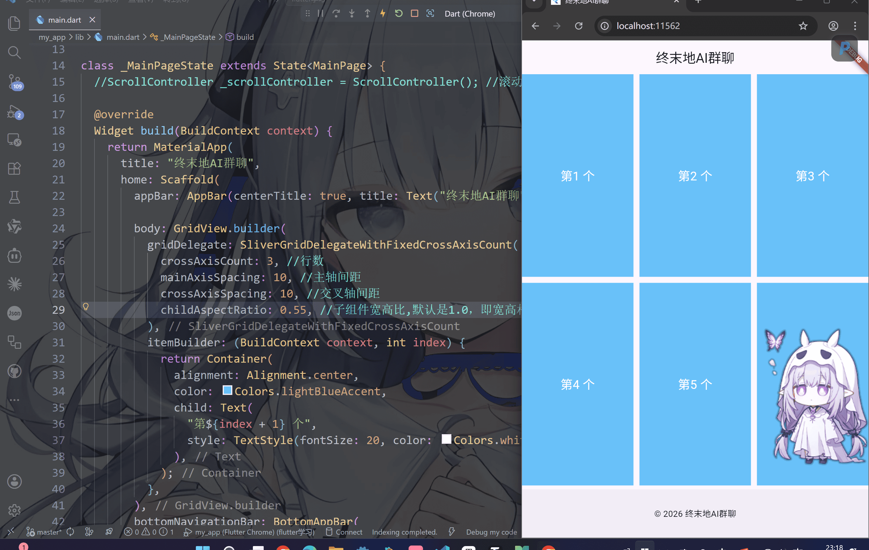
作用:使GridView.builder实现动态长网格-(懒加载,只渲染可见区域)
注意;接收gridDelegate布局委托,itemBuilder构造函数,itemCount构造数量
使用方式GridView.builder(gridDelegate: gridDelegate, itemBuilder: itemBuilder)
SliverGridDelegateWithFixedCrossAxisCount
1
2
3
4
5
6
7
8
9
10
11
12
13
14
15
16
17
18
19
20
21
22
23
24
25
26
27
28
29
30
31
32
33
34
35
36
37
38
39
40
41
42
43
44
45
46
47
48
49
| import 'package:flutter/material.dart';
void main() {
runApp(MainPage());
}
class MainPage extends StatefulWidget {
const MainPage({super.key});
@override
State<MainPage> createState() => _MainPageState();
}
class _MainPageState extends State<MainPage> {
@override
Widget build(BuildContext context) {
return MaterialApp(
title: "终末地AI群聊",
home: Scaffold(
appBar: AppBar(centerTitle: true, title: Text("终末地AI群聊")),
body: GridView.builder(
gridDelegate: SliverGridDelegateWithFixedCrossAxisCount(
crossAxisCount: 3,
mainAxisSpacing: 10,
crossAxisSpacing: 10,
),
itemBuilder: (BuildContext context, int index) {
return Container(
alignment: Alignment.center,
color: Colors.lightBlueAccent,
child: Text(
"第${index + 1} 个",
style: TextStyle(fontSize: 20, color: Colors.white),
),
);
},
),
bottomNavigationBar: BottomAppBar(
child: Container(
height: 50.0,
child: Center(child: Text("© 2026 终末地AI群聊")),
),
),
),
);
}
}
|
SliverGridDelegateWithMaxCrossAxisExtent
同样的,刚才说了extent就是组件自适应窗口,这里也是
1
2
3
4
5
6
7
8
9
10
11
12
13
14
15
16
17
18
19
20
21
22
23
24
25
26
27
28
29
30
31
32
33
34
35
36
37
38
39
40
41
42
43
44
45
46
47
48
49
50
| import 'package:flutter/material.dart';
void main() {
runApp(MainPage());
}
class MainPage extends StatefulWidget {
const MainPage({super.key});
@override
State<MainPage> createState() => _MainPageState();
}
class _MainPageState extends State<MainPage> {
@override
Widget build(BuildContext context) {
return MaterialApp(
title: "终末地AI群聊",
home: Scaffold(
appBar: AppBar(centerTitle: true, title: Text("终末地AI群聊")),
body: GridView.builder(
gridDelegate: SliverGridDelegateWithMaxCrossAxisExtent(
maxCrossAxisExtent: 100,
mainAxisSpacing: 10,
crossAxisSpacing: 10,
),
itemBuilder: (BuildContext context, int index) {
return Container(
alignment: Alignment.center,
color: Colors.lightBlueAccent,
child: Text(
"第${index + 1} 个",
style: TextStyle(fontSize: 20, color: Colors.white),
),
);
},
),
bottomNavigationBar: BottomAppBar(
child: Container(
height: 50.0,
child: Center(child: Text("© 2026 终末地AI群聊")),
),
),
),
);
}
}
|
对了,关于子组件怎么调整大小呢,可以使用这个childAspectRatio属性
你看右边的界面像不像pinterest的界面(Pinterest就是一个插画平台,上面不仅有画师分享的作品还有设计师)
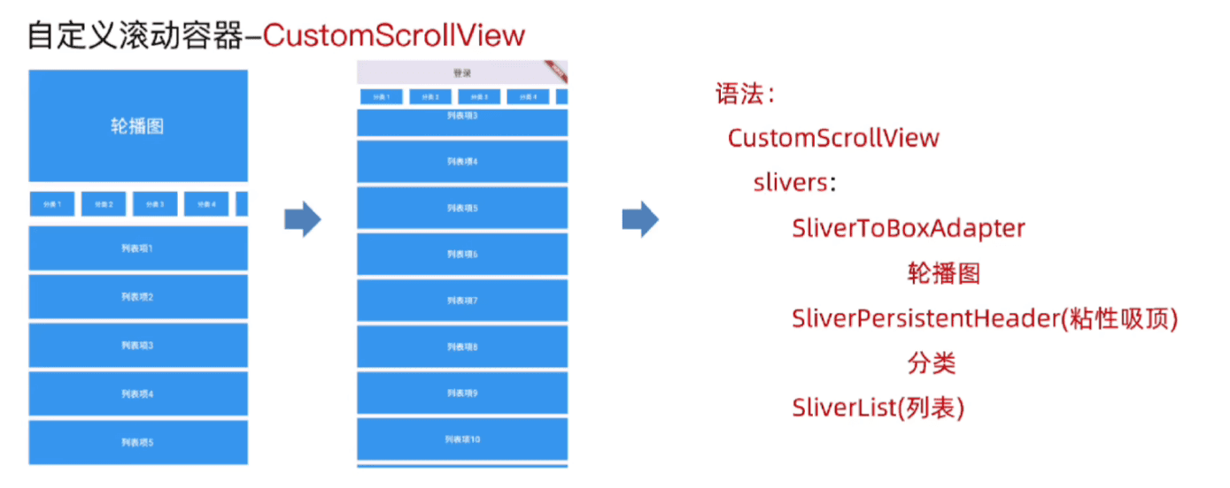
CustomScrollView 的 slivers 属性只接受 Sliver 系列的组件。普通 Widget(如 Container、Column)不能直接放入,必须通过 SliverToBoxAdapter 包装转换。
| 普通 Widget |
对应 Sliver |
用途 |
ListView |
SliverList |
垂直列表 |
GridView |
SliverGrid |
网格布局 |
AppBar |
SliverAppBar |
可折叠吸顶栏 |
| 任意 Widget |
SliverToBoxAdapter |
包装单块非重复内容 |
| 自定义吸顶 |
SliverPersistentHeader |
实现任意组件吸顶 |
通常像淘宝这样的就遵循这样的结构
1
2
3
4
5
6
7
| CustomScrollView(
slivers: [
SliverToBoxAdapter(...),
SliverPersistentHeader(...),
SliverList(...),
],
)
|
SliverToBoxAdapter轮播图的容器
作用:将普通 Widget(如 PageView 轮播图)转换为 Sliver,使其能融入 CustomScrollView 的滚动体系。
关键点:
- 只能包裹单个非重复内容
- 适合 Banner、间距、标题栏等”一次性”内容
1
2
3
4
5
6
7
8
9
10
11
12
13
14
15
16
17
18
19
20
21
22
23
24
25
26
27
28
29
30
31
32
33
34
35
36
37
38
39
40
41
42
43
44
45
46
47
48
49
50
51
52
53
| import 'package:flutter/material.dart';
void main() {
runApp(MainPage());
}
class MainPage extends StatefulWidget {
const MainPage({super.key});
@override
State<MainPage> createState() => _MainPageState();
}
class _MainPageState extends State<MainPage> {
@override
Widget build(BuildContext context) {
return MaterialApp(
title: "终末地AI群聊",
home: Scaffold(
appBar: AppBar(centerTitle: true, title: Text("终末地AI群聊")),
body: CustomScrollView(
slivers: [
SliverToBoxAdapter(
child: Container(
color: Colors.tealAccent,
alignment: Alignment.center,
height: 260,
child: Text(
"终末地AI群聊",
style: TextStyle(
color: Colors.white,
fontSize: 40,
fontWeight: FontWeight.bold,
),
),
),
),
],
),
bottomNavigationBar: BottomAppBar(
child: Container(
height: 50.0,
child: Center(child: Text("© 2026 终末地AI群聊")),
),
),
),
);
}
}
|
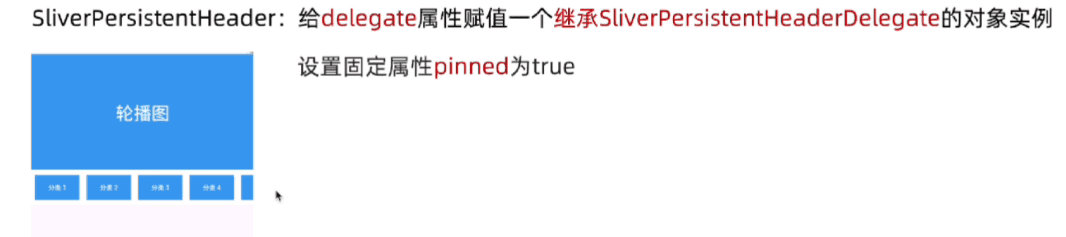
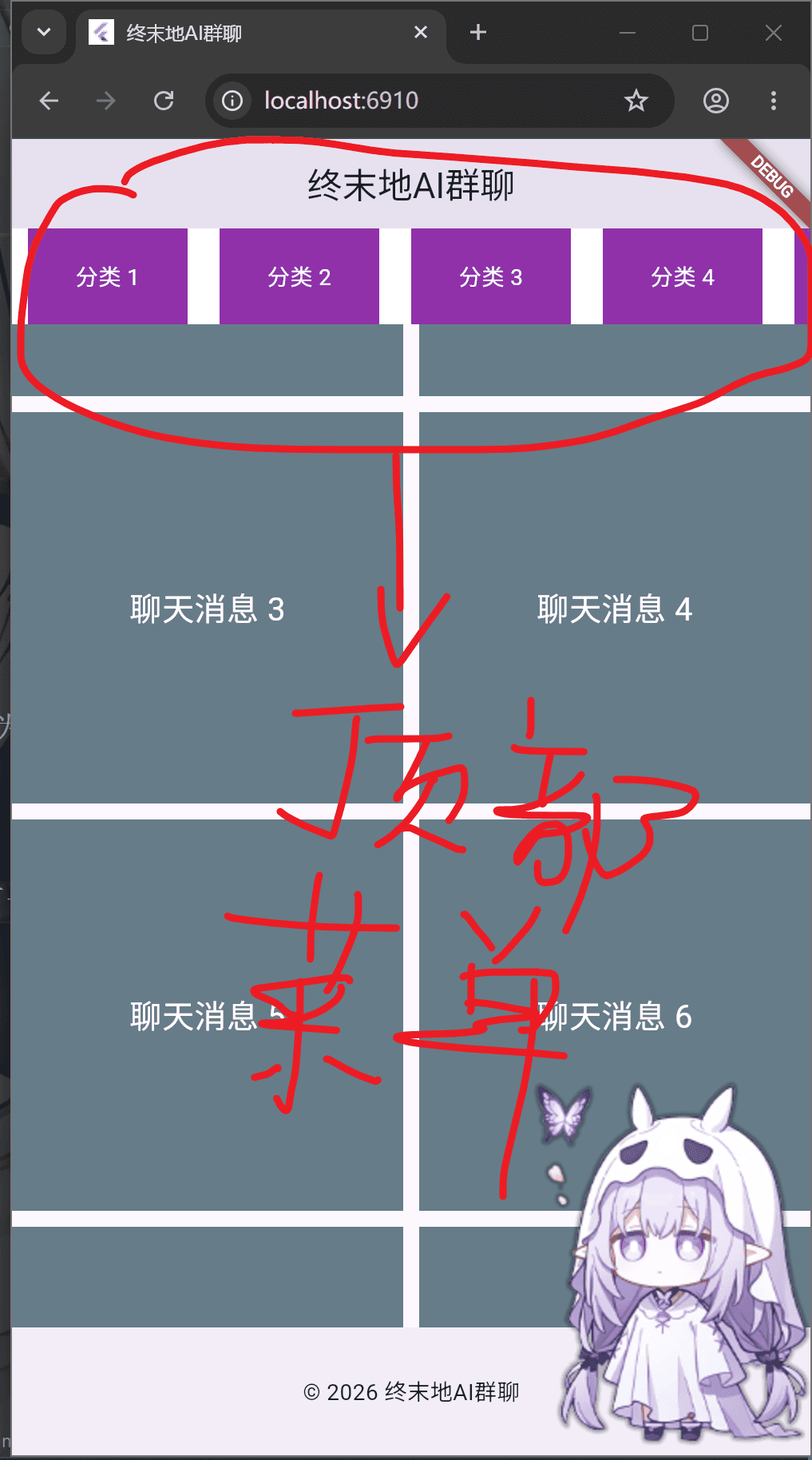
作用:让任意 Widget 在滚动到顶部时吸顶固定,比 SliverAppBar 更灵活。常用于分类筛选栏、频道 Tab。
1
2
3
4
5
6
7
8
9
10
11
12
13
14
15
16
17
18
19
20
21
22
23
24
25
26
27
28
29
30
31
32
33
34
35
36
37
38
39
40
41
42
43
44
45
46
47
48
49
50
51
52
53
54
55
| import 'package:flutter/material.dart';
void main() {
runApp(MainPage());
}
class MainPage extends StatefulWidget {
const MainPage({super.key});
@override
State<MainPage> createState() => _MainPageState();
}
class _MainPageState extends State<MainPage> {
@override
Widget build(BuildContext context) {
return MaterialApp(
title: "终末地AI群聊",
home: Scaffold(
appBar: AppBar(centerTitle: true, title: Text("终末地AI群聊")),
body: CustomScrollView(
slivers: [
SliverToBoxAdapter(
child: Container(
color: Colors.tealAccent,
alignment: Alignment.center,
height: 260,
child: Text(
"终末地AI群聊",
style: TextStyle(
color: Colors.white,
fontSize: 40,
fontWeight: FontWeight.bold,
),
),
),
),
SliverPersistentHeader(delegate: _StickyCategory()),
],
),
bottomNavigationBar: BottomAppBar(
child: Container(
height: 50.0,
child: Center(child: Text("© 2026 终末地AI群聊")),
),
),
),
);
}
}
|
注意,对于pinned参数:
pinned: true 表示 到顶部后固定
pinned: false 表示 向下滚动时会直接滑走
1
2
3
4
5
| SliverPersistentHeader(
pinned:
true,
delegate: _StickyCategory(),
),
|
必须自定义 SliverPersistentHeaderDelegate,核心参数:
minExtent:吸顶后的最小高度maxExtent:展开时的最大高度shrinkOffset:当前收缩偏移量(可用于做透明度/缩放动画)
1
2
3
4
5
6
7
8
9
10
11
12
13
14
15
16
17
18
19
20
21
22
23
24
25
26
27
28
| class _StickyCategory extends SliverPersistentHeaderDelegate {
@override
Widget build(
BuildContext context,
double shrinkOffset,
bool overlapsContent,
) {
throw UnimplementedError();
}
@override
double get maxExtent => throw UnimplementedError();
@override
double get minExtent => throw UnimplementedError();
@override
bool shouldRebuild(covariant SliverPersistentHeaderDelegate oldDelegate) {
throw UnimplementedError();
}
}
|
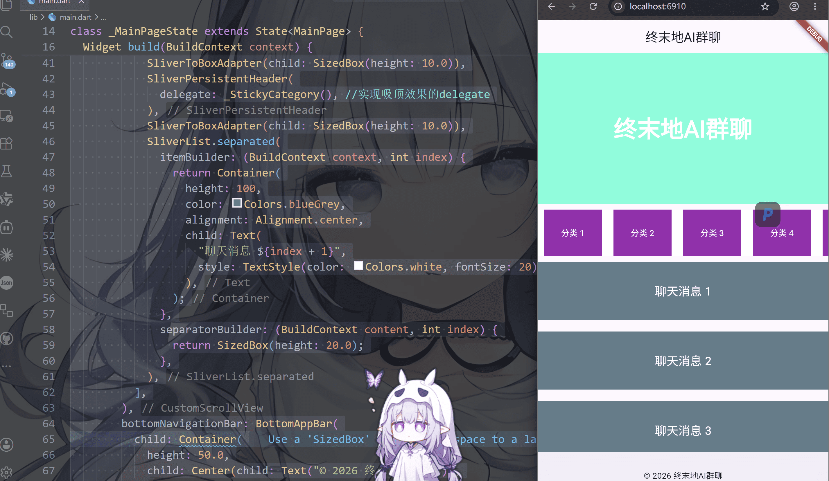
SliverList列表
1
2
3
4
5
6
7
8
9
10
11
12
13
14
15
16
17
18
19
20
21
22
23
24
25
26
27
28
29
30
31
32
33
34
35
36
37
38
39
40
41
42
43
44
45
46
47
48
49
50
51
52
53
54
55
56
57
58
59
60
61
62
63
64
65
66
67
68
69
70
71
72
73
74
75
76
77
78
79
80
81
82
83
84
85
86
87
88
89
90
91
92
93
94
95
96
97
98
99
100
101
102
103
104
105
106
107
108
109
110
111
112
113
114
115
116
117
118
119
120
121
122
123
124
125
126
127
128
129
| import 'package:flutter/material.dart';
void main() {
runApp(MainPage());
}
class MainPage extends StatefulWidget {
const MainPage({super.key});
@override
State<MainPage> createState() => _MainPageState();
}
class _MainPageState extends State<MainPage> {
@override
Widget build(BuildContext context) {
return MaterialApp(
title: "终末地AI群聊",
home: Scaffold(
appBar: AppBar(centerTitle: true, title: Text("终末地AI群聊")),
body: CustomScrollView(
slivers: [
SliverToBoxAdapter(
child: Container(
color: Colors.tealAccent,
alignment: Alignment.center,
height: 260,
child: Text(
"终末地AI群聊",
style: TextStyle(
color: Colors.white,
fontSize: 40,
fontWeight: FontWeight.bold,
),
),
),
),
SliverToBoxAdapter(child: SizedBox(height: 10.0)),
SliverPersistentHeader(
delegate: _StickyCategory(),
),
SliverToBoxAdapter(child: SizedBox(height: 10.0)),
SliverList.separated(
itemBuilder: (BuildContext context, int index) {
return Container(
height: 100,
color: Colors.blueGrey,
alignment: Alignment.center,
child: Text(
"聊天消息 ${index + 1}",
style: TextStyle(color: Colors.white, fontSize: 20),
),
);
},
separatorBuilder: (BuildContext content, int index) {
return SizedBox(height: 20.0);
},
),
],
),
bottomNavigationBar: BottomAppBar(
child: Container(
height: 50.0,
child: Center(child: Text("© 2026 终末地AI群聊")),
),
),
),
);
}
}
class _StickyCategory extends SliverPersistentHeaderDelegate {
@override
Widget build(
BuildContext context,
double shrinkOffset,
bool overlapsContent,
) {
return Container(
color: Colors.white,
child: ListView.builder(
itemCount: 30,
scrollDirection: Axis.horizontal,
itemBuilder: (BuildContext context, int index) {
return Container(
width: 100,
margin: EdgeInsets.symmetric(horizontal: 10.0),
alignment: Alignment.center,
color: Colors.purple,
child: Text(
"分类 ${index + 1}",
style: TextStyle(color: Colors.white),
),
);
},
),
);
}
@override
double get maxExtent => 80;
@override
double get minExtent => 60;
@override
bool shouldRebuild(covariant SliverPersistentHeaderDelegate oldDelegate) {
return false;
}
}
|
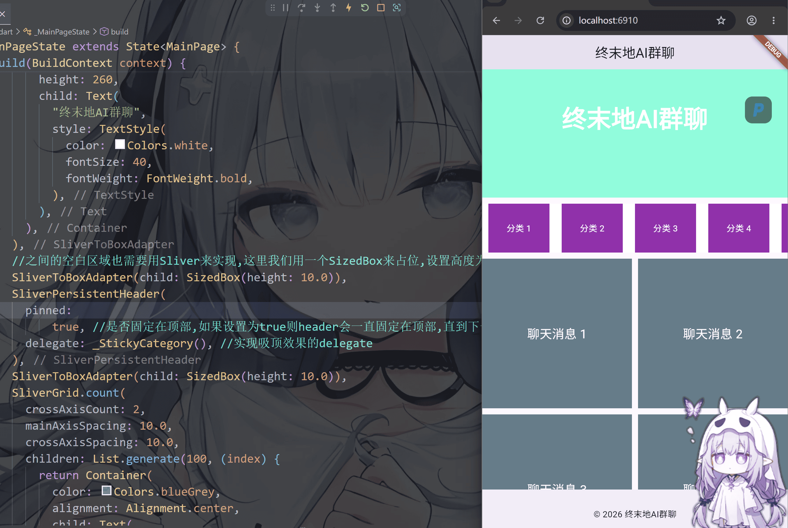
SliverGrid宫格
1
2
3
4
5
6
7
8
9
10
11
12
13
14
15
16
17
18
19
20
21
22
23
24
25
26
27
28
29
30
31
32
33
34
35
36
37
38
39
40
41
42
43
44
45
46
47
48
49
50
51
52
53
54
55
56
57
58
59
60
61
62
63
64
65
66
67
68
69
70
71
72
73
74
75
76
77
78
79
80
81
82
83
84
85
86
87
88
89
90
91
92
93
94
95
96
97
98
99
100
101
102
103
104
105
106
107
108
109
110
111
112
113
114
115
116
117
118
119
120
121
122
123
124
125
| import 'package:flutter/material.dart';
void main() {
runApp(MainPage());
}
class MainPage extends StatefulWidget {
const MainPage({super.key});
@override
State<MainPage> createState() => _MainPageState();
}
class _MainPageState extends State<MainPage> {
@override
Widget build(BuildContext context) {
return MaterialApp(
title: "终末地AI群聊",
home: Scaffold(
appBar: AppBar(centerTitle: true, title: Text("终末地AI群聊")),
body: CustomScrollView(
slivers: [
SliverToBoxAdapter(
child: Container(
color: Colors.tealAccent,
alignment: Alignment.center,
height: 260,
child: Text(
"终末地AI群聊",
style: TextStyle(
color: Colors.white,
fontSize: 40,
fontWeight: FontWeight.bold,
),
),
),
),
SliverToBoxAdapter(child: SizedBox(height: 10.0)),
SliverPersistentHeader(
delegate: _StickyCategory(),
),
SliverToBoxAdapter(child: SizedBox(height: 10.0)),
SliverGrid.count(
crossAxisCount: 2,
mainAxisSpacing: 10.0,
crossAxisSpacing: 10.0,
children: List.generate(100, (index) {
return Container(
color: Colors.blueGrey,
alignment: Alignment.center,
child: Text(
"聊天消息 ${index + 1}",
style: TextStyle(color: Colors.white, fontSize: 20),
),
);
}),
),
],
),
bottomNavigationBar: BottomAppBar(
child: Container(
height: 50.0,
child: Center(child: Text("© 2026 终末地AI群聊")),
),
),
),
);
}
}
class _StickyCategory extends SliverPersistentHeaderDelegate {
@override
Widget build(
BuildContext context,
double shrinkOffset,
bool overlapsContent,
) {
return Container(
color: Colors.white,
child: ListView.builder(
itemCount: 30,
scrollDirection: Axis.horizontal,
itemBuilder: (BuildContext context, int index) {
return Container(
width: 100,
margin: EdgeInsets.symmetric(horizontal: 10.0),
alignment: Alignment.center,
color: Colors.purple,
child: Text(
"分类 ${index + 1}",
style: TextStyle(color: Colors.white),
),
);
},
),
);
}
@override
double get maxExtent => 80;
@override
double get minExtent => 60;
@override
bool shouldRebuild(covariant SliverPersistentHeaderDelegate oldDelegate) {
return false;
}
}
|
PageView
PageView 是 Flutter 中实现横向/纵向翻页滑动的核心组件,常用于轮播图、引导页、Tab 内容切换等场景
作用: 用于实现分页滚动视图的核心组件
方式: 提供多种构建方式,默认构造范式,Pageview.builder等
| 构造函数 |
适用场景 |
PageView() |
页面数量固定且少 |
PageView.builder() |
页面数量多或动态数据(懒加载) |
PageView.custom() |
需要完全自定义子项控制 |
1
2
3
4
5
6
7
8
9
10
11
12
13
14
15
16
17
18
19
20
21
22
23
24
25
26
27
28
29
30
31
32
33
34
35
36
37
38
39
40
41
42
43
44
45
46
47
48
49
50
51
52
53
54
55
56
57
58
59
60
61
62
63
64
65
66
67
68
69
70
71
72
73
74
75
76
77
78
79
80
81
82
83
84
85
86
87
88
89
90
91
92
93
94
95
96
97
98
99
100
101
102
103
104
105
106
107
108
109
110
111
112
113
114
115
116
117
118
119
120
121
122
123
124
125
126
127
128
129
130
131
132
133
134
135
136
| import 'package:flutter/material.dart';
void main() {
runApp(MainPage());
}
class MainPage extends StatefulWidget {
const MainPage({super.key});
@override
State<MainPage> createState() => _MainPageState();
}
class _MainPageState extends State<MainPage> {
@override
Widget build(BuildContext context) {
return MaterialApp(
title: "终末地AI群聊",
home: Scaffold(
appBar: AppBar(centerTitle: true, title: Text("终末地AI群聊")),
body: CustomScrollView(
slivers: [
SliverToBoxAdapter(
child: Container(
color: Colors.tealAccent,
alignment: Alignment.center,
height: 260,
child: PageView.builder(
itemCount: 10,
itemBuilder: (BuildContext context, int index) {
return Container(
alignment: Alignment.center,
child: Text(
"轮播图 ${index + 1}",
style: TextStyle(
fontSize: 24,
fontWeight: FontWeight.bold,
color: Colors.white,
),
),
);
},
),
),
),
SliverToBoxAdapter(child: SizedBox(height: 10.0)),
SliverPersistentHeader(
pinned:
true,
delegate: _StickyCategory(),
),
SliverToBoxAdapter(child: SizedBox(height: 10.0)),
SliverGrid.count(
crossAxisCount: 2,
mainAxisSpacing: 10.0,
crossAxisSpacing: 10.0,
children: List.generate(100, (index) {
return Container(
color: Colors.blueGrey,
alignment: Alignment.center,
child: Text(
"聊天消息 ${index + 1}",
style: TextStyle(color: Colors.white, fontSize: 20),
),
);
}),
),
],
),
bottomNavigationBar: BottomAppBar(
child: Container(
height: 50.0,
child: Center(child: Text("© 2026 终末地AI群聊")),
),
),
),
);
}
}
class _StickyCategory extends SliverPersistentHeaderDelegate {
@override
Widget build(
BuildContext context,
double shrinkOffset,
bool overlapsContent,
) {
return Container(
color: Colors.white,
child: ListView.builder(
itemCount: 30,
scrollDirection: Axis.horizontal,
itemBuilder: (BuildContext context, int index) {
return Container(
width: 100,
margin: EdgeInsets.symmetric(horizontal: 10.0),
alignment: Alignment.center,
color: Colors.purple,
child: Text(
"分类 ${index + 1}",
style: TextStyle(color: Colors.white),
),
);
},
),
);
}
@override
double get maxExtent => 80;
@override
double get minExtent => 60;
@override
bool shouldRebuild(covariant SliverPersistentHeaderDelegate oldDelegate) {
return false;
}
}
|
PageView跳转控制
1
2
3
4
5
6
7
8
9
10
11
12
13
14
15
16
17
18
19
20
21
22
23
24
25
26
27
28
29
30
31
32
33
34
35
36
37
38
39
40
41
42
43
44
45
46
47
48
49
50
51
52
53
54
55
56
57
58
59
60
61
62
63
64
65
66
67
68
69
70
71
72
73
74
75
76
77
78
79
80
81
82
83
84
85
86
87
88
89
90
91
92
93
94
95
96
97
98
99
100
101
102
103
104
105
106
107
108
109
110
111
112
113
114
115
116
117
118
119
120
121
122
123
124
125
126
127
128
129
130
131
132
133
134
135
136
137
138
139
140
141
142
143
144
145
146
147
148
149
150
151
152
153
154
155
156
157
158
159
160
161
162
163
164
165
166
167
168
169
170
171
172
173
174
175
176
177
178
179
180
181
182
183
184
185
186
187
188
189
190
| import 'package:flutter/material.dart';
void main() {
runApp(MainPage());
}
class MainPage extends StatefulWidget {
const MainPage({super.key});
@override
State<MainPage> createState() => _MainPageState();
}
class _MainPageState extends State<MainPage> {
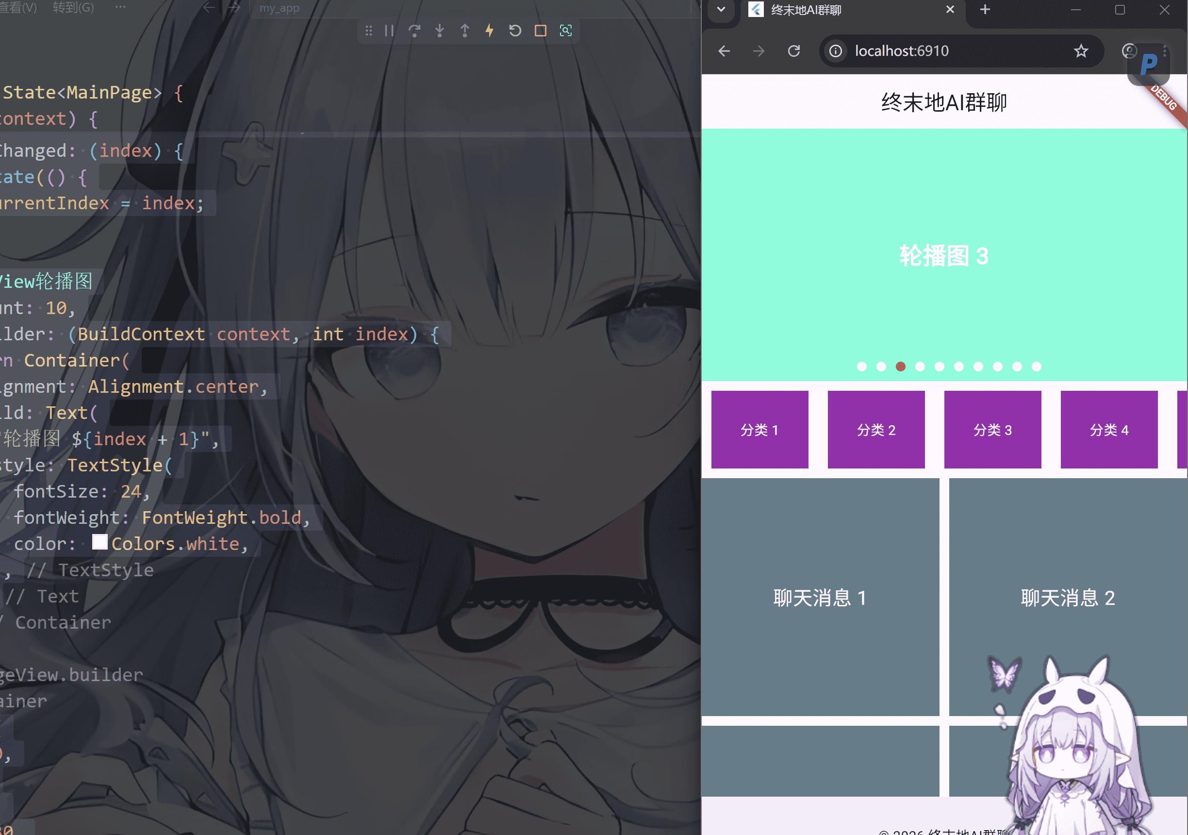
int _currentIndex = 0;
PageController _controller = PageController();
@override
Widget build(BuildContext context) {
return MaterialApp(
title: "终末地AI群聊",
home: Scaffold(
appBar: AppBar(centerTitle: true, title: Text("终末地AI群聊")),
body: CustomScrollView(
slivers: [
SliverToBoxAdapter(
child: Stack(
children: [
Container(
color: Colors.tealAccent,
alignment: Alignment.center,
height: 260,
child: PageView.builder(
controller: _controller,
onPageChanged: (index) {
setState(() {
_currentIndex = index;
});
},
itemCount: 10,
itemBuilder: (BuildContext context, int index) {
return Container(
alignment: Alignment.center,
child: Text(
"轮播图 ${index + 1}",
style: TextStyle(
fontSize: 24,
fontWeight: FontWeight.bold,
color: Colors.white,
),
),
);
},
),
),
Positioned(
bottom: 0,
left: 0,
right: 0,
height: 30,
child: Container(
child: Row(
mainAxisAlignment: MainAxisAlignment.center,
children: List.generate(10, (index) {
return GestureDetector(
onTap: () {
_controller.animateToPage(
index,
duration: Duration(microseconds: 300),
curve: Curves.linear,
);
},
child: Container(
margin: EdgeInsets.only(left: 10),
width: 10,
height: 10,
decoration: BoxDecoration(
color: _currentIndex == index
? Colors.red
: Colors.white,
borderRadius: BorderRadius.circular(5),
),
),
);
}),
),
),
),
],
),
),
SliverToBoxAdapter(child: SizedBox(height: 10.0)),
SliverPersistentHeader(
pinned:
true,
delegate: _StickyCategory(),
),
SliverToBoxAdapter(child: SizedBox(height: 10.0)),
SliverGrid.count(
crossAxisCount: 2,
mainAxisSpacing: 10.0,
crossAxisSpacing: 10.0,
children: List.generate(100, (index) {
return Container(
color: Colors.blueGrey,
alignment: Alignment.center,
child: Text(
"聊天消息 ${index + 1}",
style: TextStyle(color: Colors.white, fontSize: 20),
),
);
}),
),
],
),
bottomNavigationBar: BottomAppBar(
child: Container(
height: 50.0,
child: Center(child: Text("© 2026 终末地AI群聊")),
),
),
),
);
}
}
class _StickyCategory extends SliverPersistentHeaderDelegate {
@override
Widget build(
BuildContext context,
double shrinkOffset,
bool overlapsContent,
) {
return Container(
color: Colors.white,
child: ListView.builder(
itemCount: 30,
scrollDirection: Axis.horizontal,
itemBuilder: (BuildContext context, int index) {
return Container(
width: 100,
margin: EdgeInsets.symmetric(horizontal: 10.0),
alignment: Alignment.center,
color: Colors.purple,
child: Text(
"分类 ${index + 1}",
style: TextStyle(color: Colors.white),
),
);
},
),
);
}
@override
double get maxExtent => 80;
@override
double get minExtent => 60;
@override
bool shouldRebuild(covariant SliverPersistentHeaderDelegate oldDelegate) {
return false;
}
}
|
卡片层叠效果(viewportFraction)
1
2
3
4
5
6
7
8
9
10
11
12
13
14
15
16
17
18
19
20
21
22
23
24
25
26
27
28
29
30
31
32
33
34
35
36
37
38
39
40
41
42
43
44
45
46
47
48
49
50
51
52
53
54
55
56
57
58
59
60
61
62
63
64
65
66
67
68
69
70
71
72
73
74
75
76
77
78
79
80
81
82
83
84
85
86
87
88
89
90
91
92
93
94
95
96
97
98
99
100
101
102
103
104
105
106
107
108
109
110
111
112
113
114
115
116
117
118
119
120
121
122
123
124
125
126
127
128
129
130
131
132
133
134
135
136
137
138
139
140
141
142
143
144
145
146
| import 'package:flutter/material.dart';
void main() {
runApp(MainPage());
}
class MainPage extends StatefulWidget {
const MainPage({super.key});
@override
State<MainPage> createState() => _MainPageState();
}
class _MainPageState extends State<MainPage> {
late PageController _controller;
@override
Widget build(BuildContext context) {
_controller = PageController(viewportFraction: 0.85);
return MaterialApp(
title: "终末地AI群聊",
home: Scaffold(
appBar: AppBar(centerTitle: true, title: Text("终末地AI群聊")),
body: CustomScrollView(
slivers: [
SliverToBoxAdapter(
child: Container(
color: Colors.tealAccent,
alignment: Alignment.center,
height: 260,
child: PageView.builder(
controller: _controller,
itemBuilder: (context, index) {
return AnimatedBuilder(
animation: _controller,
builder: (context, child) {
double value = 1.0;
if (_controller.position.haveDimensions) {
value = (_controller.page! - index).abs();
value = (1 - (value * 0.3)).clamp(0.85, 1.0);
}
return Transform.scale(scale: value, child: child);
},
child: Container(
margin: const EdgeInsets.symmetric(horizontal: 8),
decoration: BoxDecoration(
borderRadius: BorderRadius.circular(16),
color:
Colors.primaries[index % Colors.primaries.length],
),
),
);
},
),
),
),
SliverToBoxAdapter(child: SizedBox(height: 10.0)),
SliverPersistentHeader(
pinned:
true,
delegate: _StickyCategory(),
),
SliverToBoxAdapter(child: SizedBox(height: 10.0)),
SliverGrid.count(
crossAxisCount: 2,
mainAxisSpacing: 10.0,
crossAxisSpacing: 10.0,
children: List.generate(100, (index) {
return Container(
color: Colors.blueGrey,
alignment: Alignment.center,
child: Text(
"聊天消息 ${index + 1}",
style: TextStyle(color: Colors.white, fontSize: 20),
),
);
}),
),
],
),
bottomNavigationBar: BottomAppBar(
child: Container(
height: 50.0,
child: Center(child: Text("© 2026 终末地AI群聊")),
),
),
),
);
}
}
class _StickyCategory extends SliverPersistentHeaderDelegate {
@override
Widget build(
BuildContext context,
double shrinkOffset,
bool overlapsContent,
) {
return Container(
color: Colors.white,
child: ListView.builder(
itemCount: 30,
scrollDirection: Axis.horizontal,
itemBuilder: (BuildContext context, int index) {
return Container(
width: 100,
margin: EdgeInsets.symmetric(horizontal: 10.0),
alignment: Alignment.center,
color: Colors.purple,
child: Text(
"分类 ${index + 1}",
style: TextStyle(color: Colors.white),
),
);
},
),
);
}
@override
double get maxExtent => 80;
@override
double get minExtent => 60;
@override
bool shouldRebuild(covariant SliverPersistentHeaderDelegate oldDelegate) {
return false;
}
}
|

评论区